Summary
Summary
Discovery
Discovery
Visual Approaches
Visual Approaches
Building Blocks
Building Blocks
Icon Library
Icon Library
Dashboards
Dashboards
Light & Dark Theme
Light & Dark Theme
Reaction
Reaction
Impact
Impact
Conclusion
Conclusion
ALL WORK

DATA VIS · B2B · IT INFRASTRUCTURE

OPSVIEW BSM

Business Service Monitoring — a unified, root-cause view of the entire IT estate for enterprise teams.

I want to see my entire global-estate in a single view, It’s also critical that my team are able to drill into the details, and fix things before services fail
IT Director
Cisco

My role

I led the end-to-end user experience and interface design for this Business Service Monitoring platform. My role focused on translating the complexity of hybrid IT infrastructure management into a clear, intuitive, and scalable product experience for both IT leaders and operational users. I was responsible for defining the product’s UX strategy, information architecture, interaction patterns, and visual design system.

Scope New UX and product vision
Role UX Lead, product management
Duration 2019 - 2020
Outcomes Flagship product featured in sales and marketing

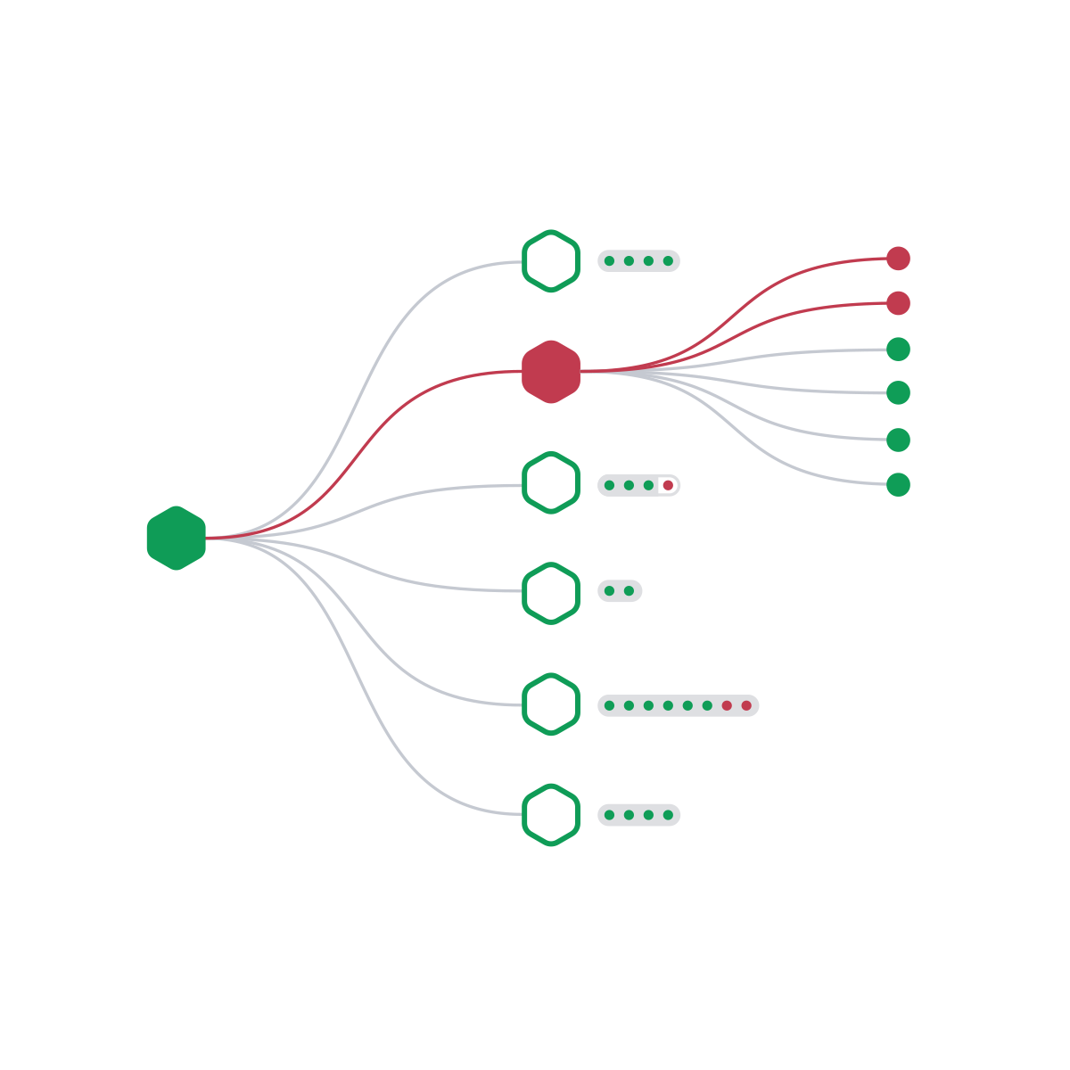
Anatomy of the Business Service Monitoring platform
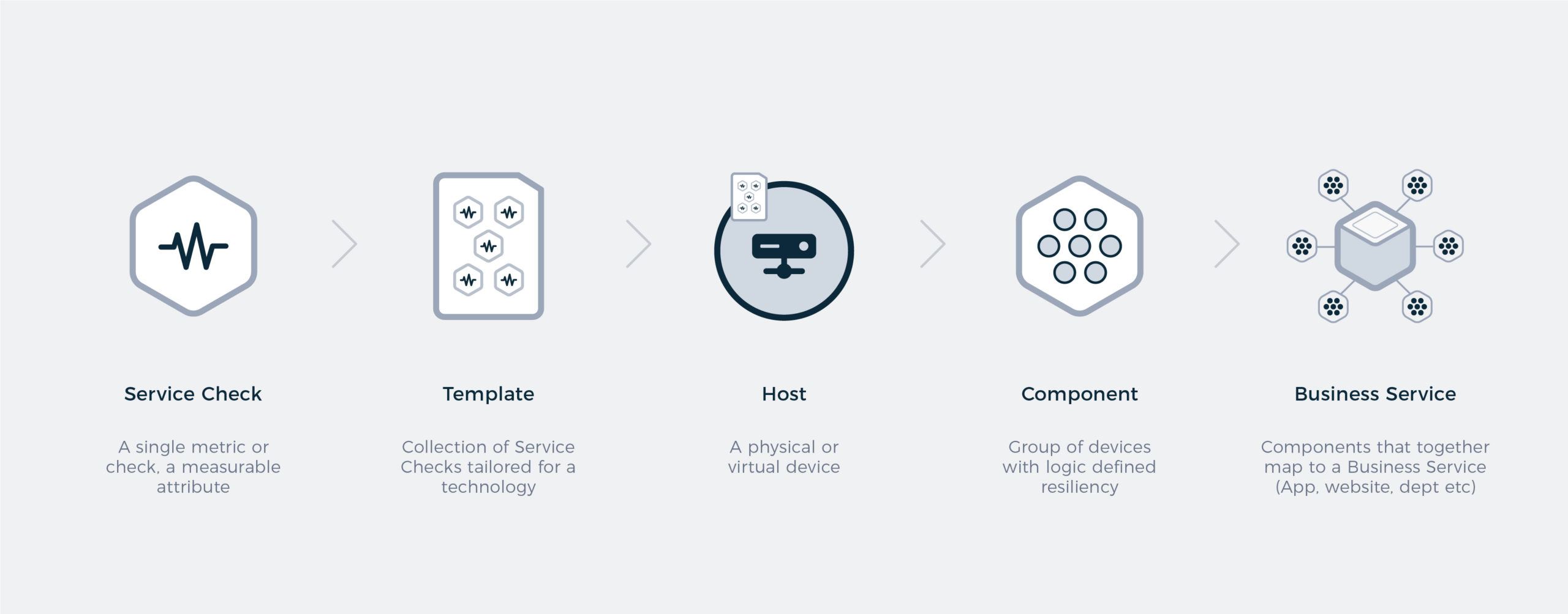
Anatomy of the Business Service Monitoring platform

Discovery

The first step in tackling this challenge was developing a deep understanding of the platform’s existing complexity and the multifaceted nature of the problem space. This meant immersing myself in the technical nuances of the product, the realities of hybrid IT infrastructure management, and the varied needs of its users. Only by fully understanding the existing model could I confidently challenge assumptions and propose solutions that felt both innovative and credible.

This understanding was built through research, close collaboration with engineering teams, and interviews with customers. Together, we explored how complex business services and their interdependencies could be visualised in a way that was both highly detailed and genuinely usable. A key focus was improving readability — enabling users to understand issues in context, identify root causes quickly, and navigate dense information environments while minimising cognitive load.


Radial topology diagram

Radial topology

Nodes expand into a radial cluster, revealing a topology view with Host level detail and the status of their relationships.

Notes

Harder to view issues in a larger context, due to complexity the detailed view could quickly become difficult to read.

Topology diagram 2

Force Diagram

Nodes expand into a radial chart, revealing Host level detail. Detail of service availability, and operational thresholds are also seen.

Notes

Requires more exploration and effort to drill down into each node. The resultant maps would be non-hierarchical.

Topology diagram 3

Tree Diagram

Nodes are organised in a tree, a parent/child relationship is apparent between services, components, hosts, and service checks.

Notes

Perhaps not as visually dynamic as the others but much clearer to scan, easier to read, displaying problems in a larger context.

Phase 1 system flow diagram

Building Blocks

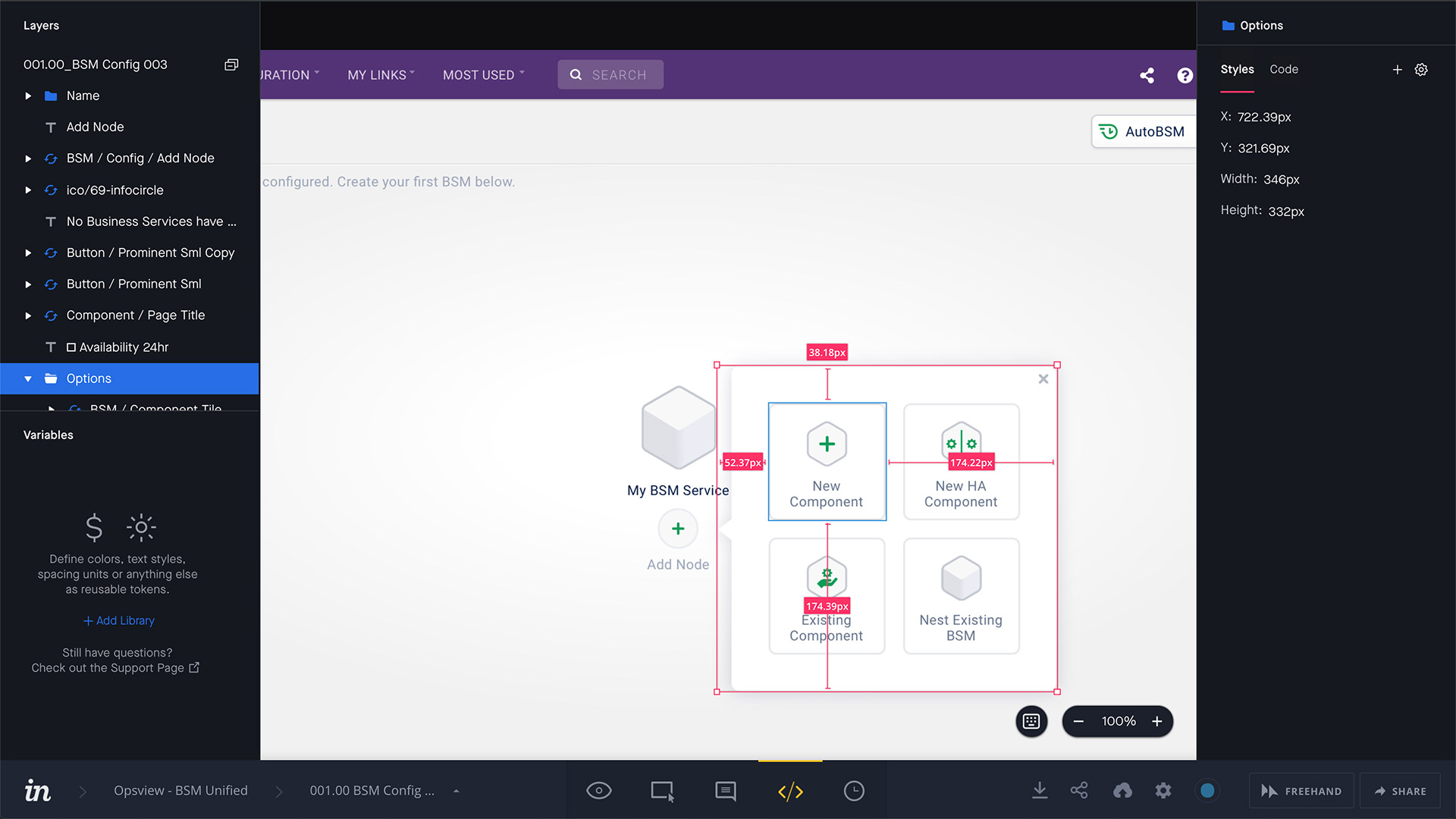
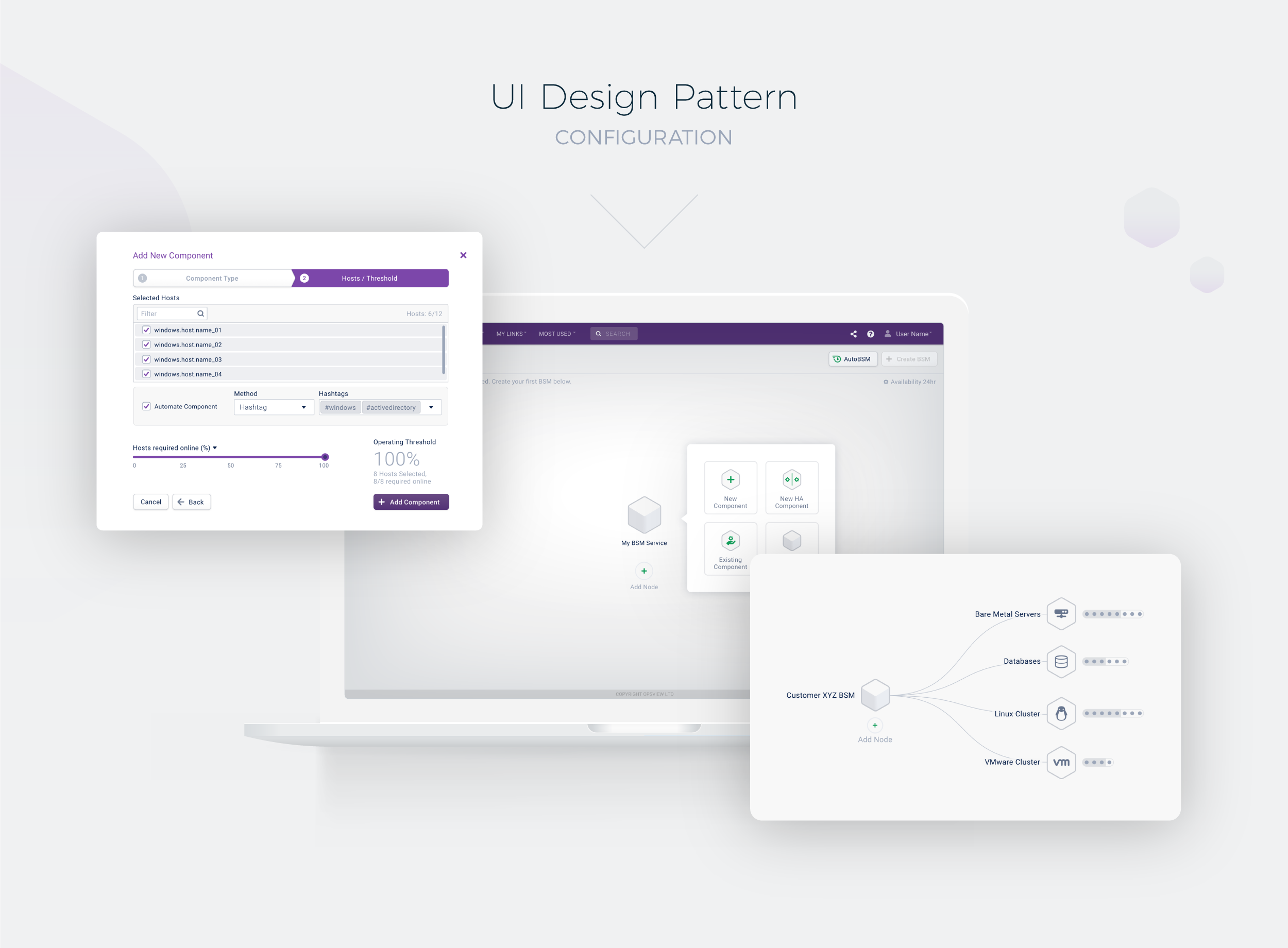
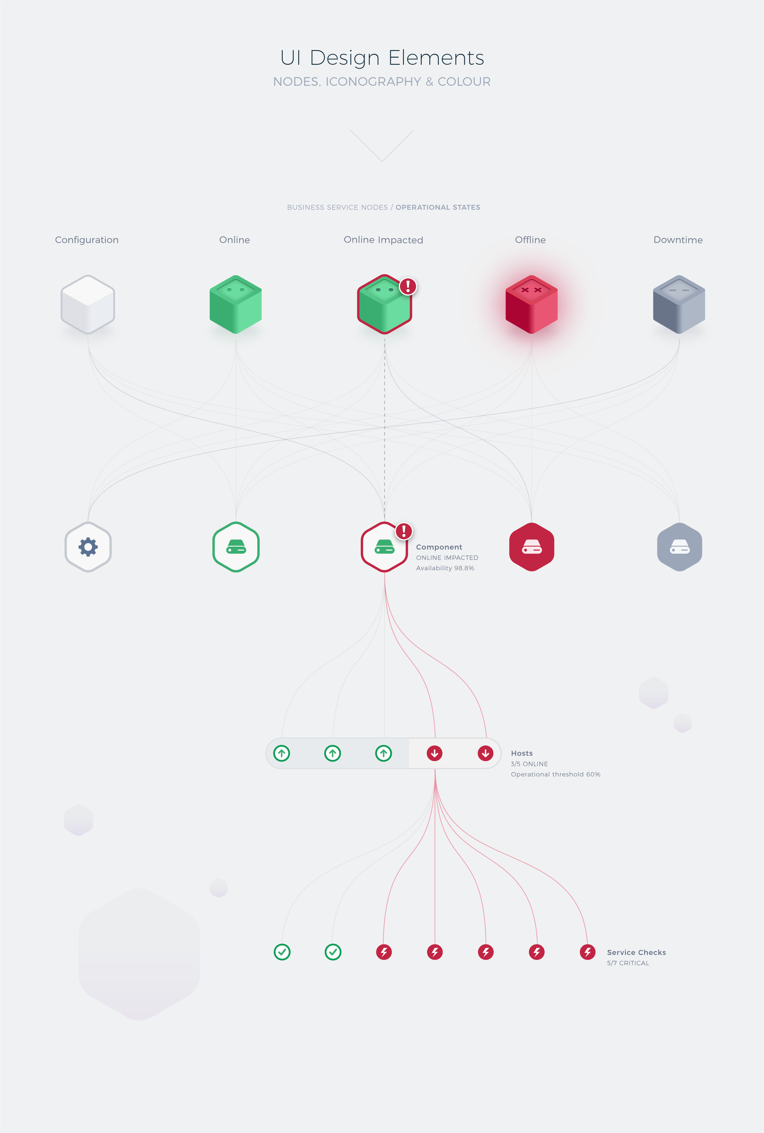
Once the core structure of the visualisation had been defined, I explored a range of UI directions to elevate the overall look and feel of the platform. I ultimately developed the concept of “building blocks” rendered in an isometric style — a visual metaphor that aligned naturally with the way users would construct services piece by piece within the system.

This approach reinforced the relationship between configuration and monitoring, creating a more unified experience where the structure users built during setup was retained in the live operational view. The result was a clearer mental model of the service architecture and a more intuitive way to understand complex systems visually.

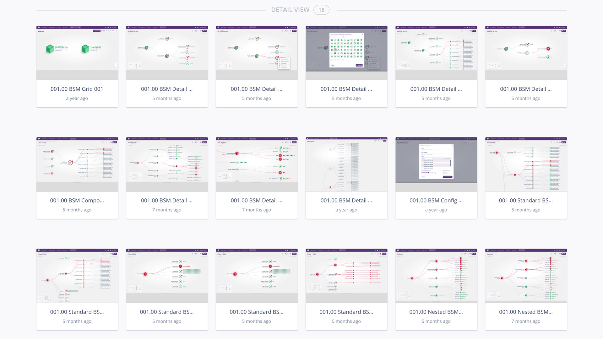
To refine these ideas, I facilitated feedback sessions with selected customers, using collaborative workshops to identify pain points and validate interaction patterns. Through this iterative process, we established a more streamlined user journey. The flexibility of the new structure also enabled more sophisticated logic-based grouping, alongside clearer definitions of service availability, dependencies, and overall health.

UI Design Components

Icon Library

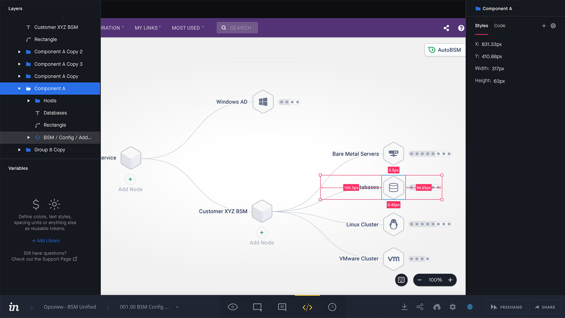
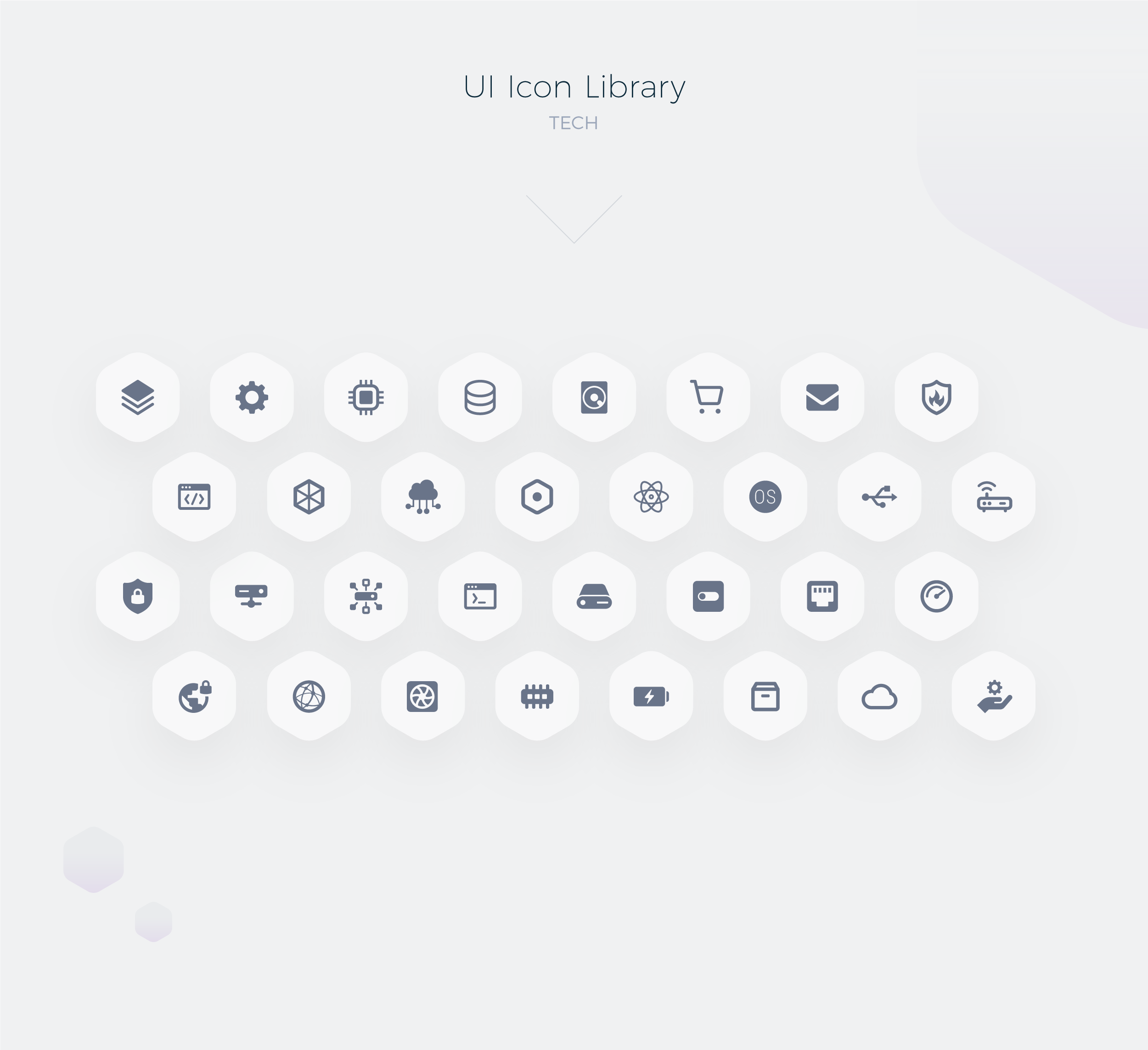
To enrich the visual design language and improve overall readability, I designed a suite of technology icons to extend the existing Opsview icon font. These new glyphs were mapped to the technologies most commonly used by our customers, helping users quickly identify components and services at a glance.

To support usability at scale, I also introduced search and filtering functionality, enabling users to quickly find and assign relevant icons to components within each service. This added a clearer visual hierarchy to complex service maps while improving speed and efficiency during configuration.

Custom icon suite for building business services

Dashboards

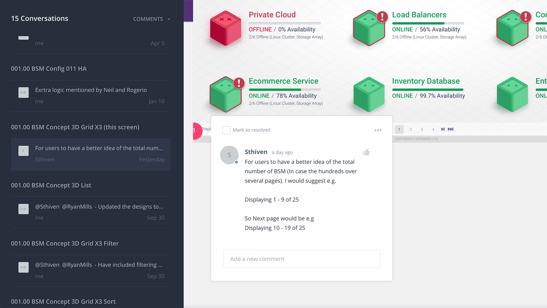
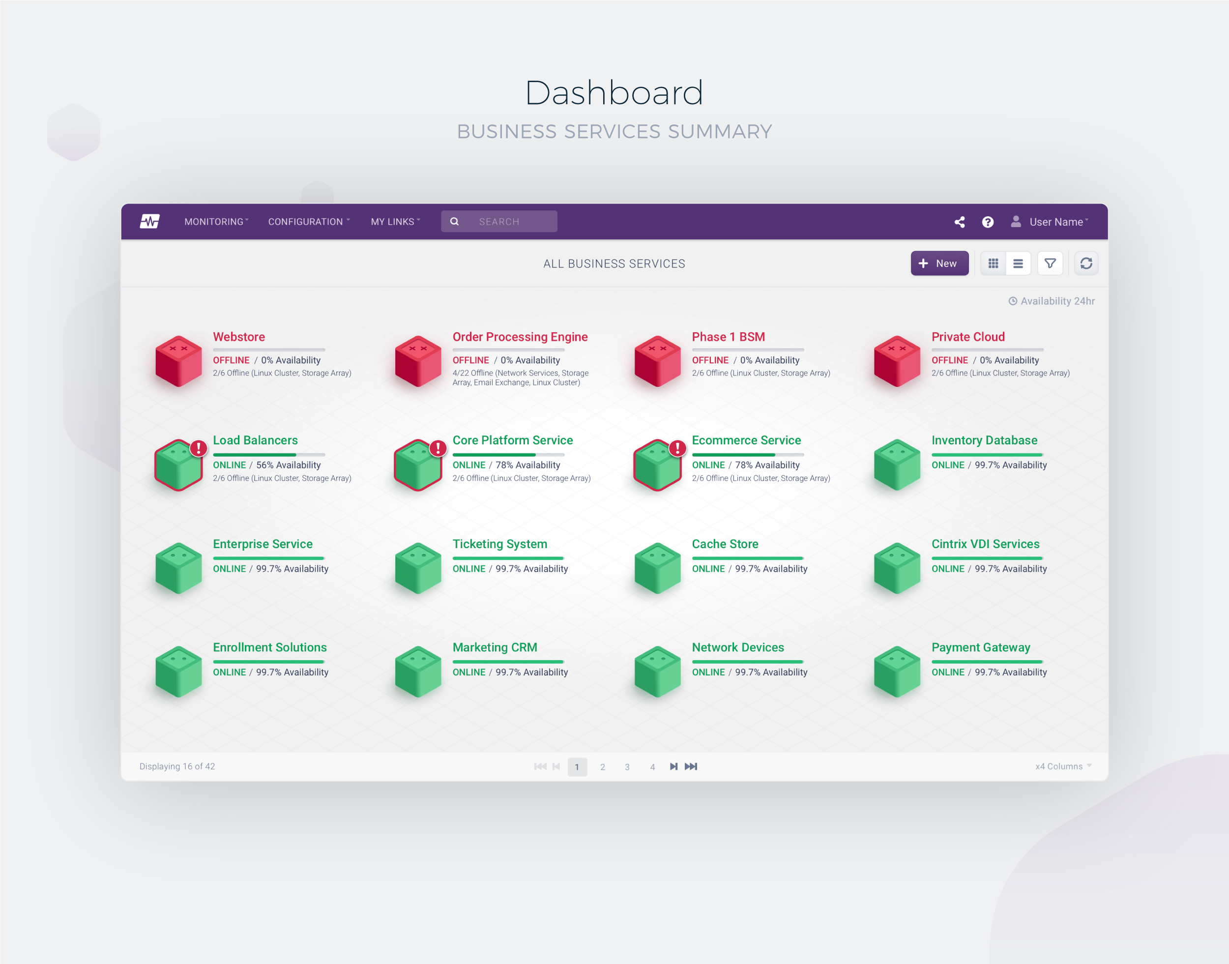
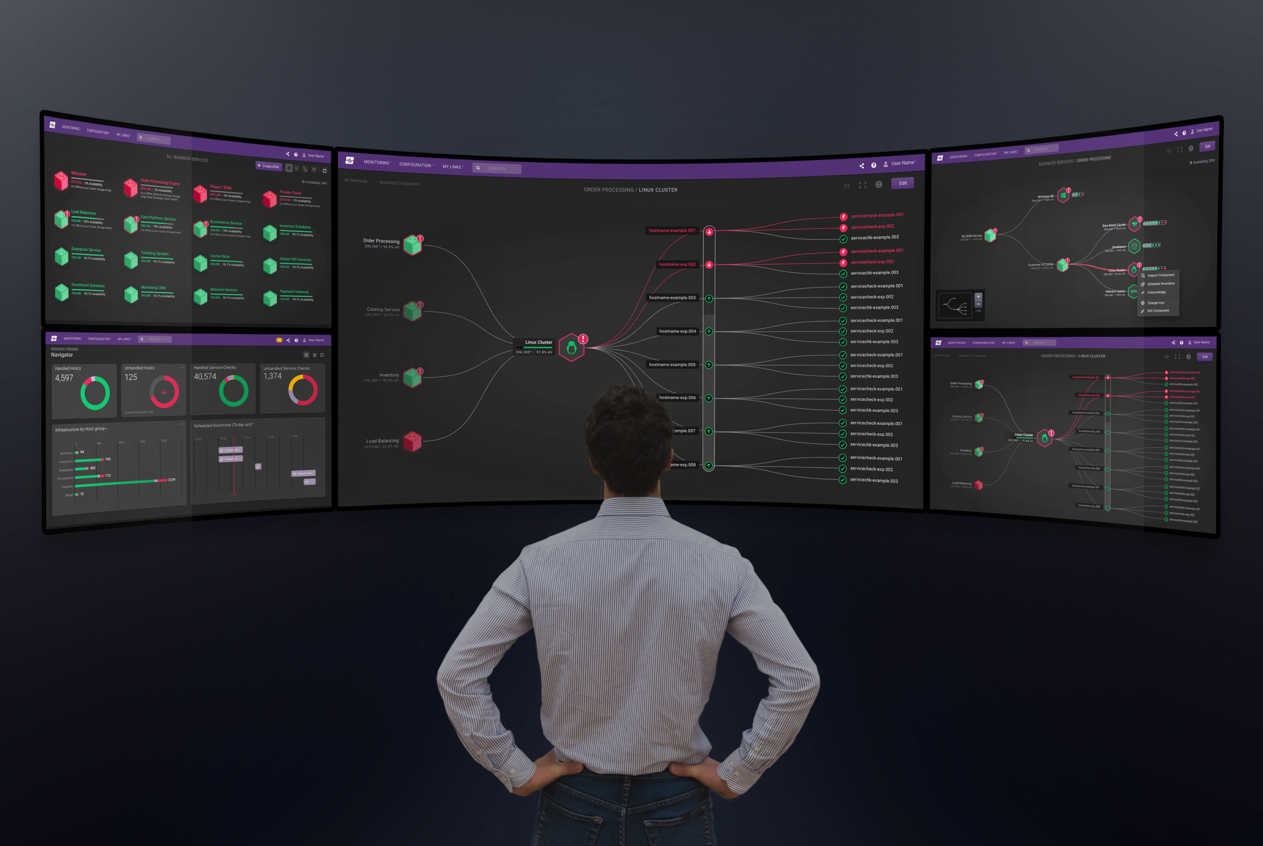
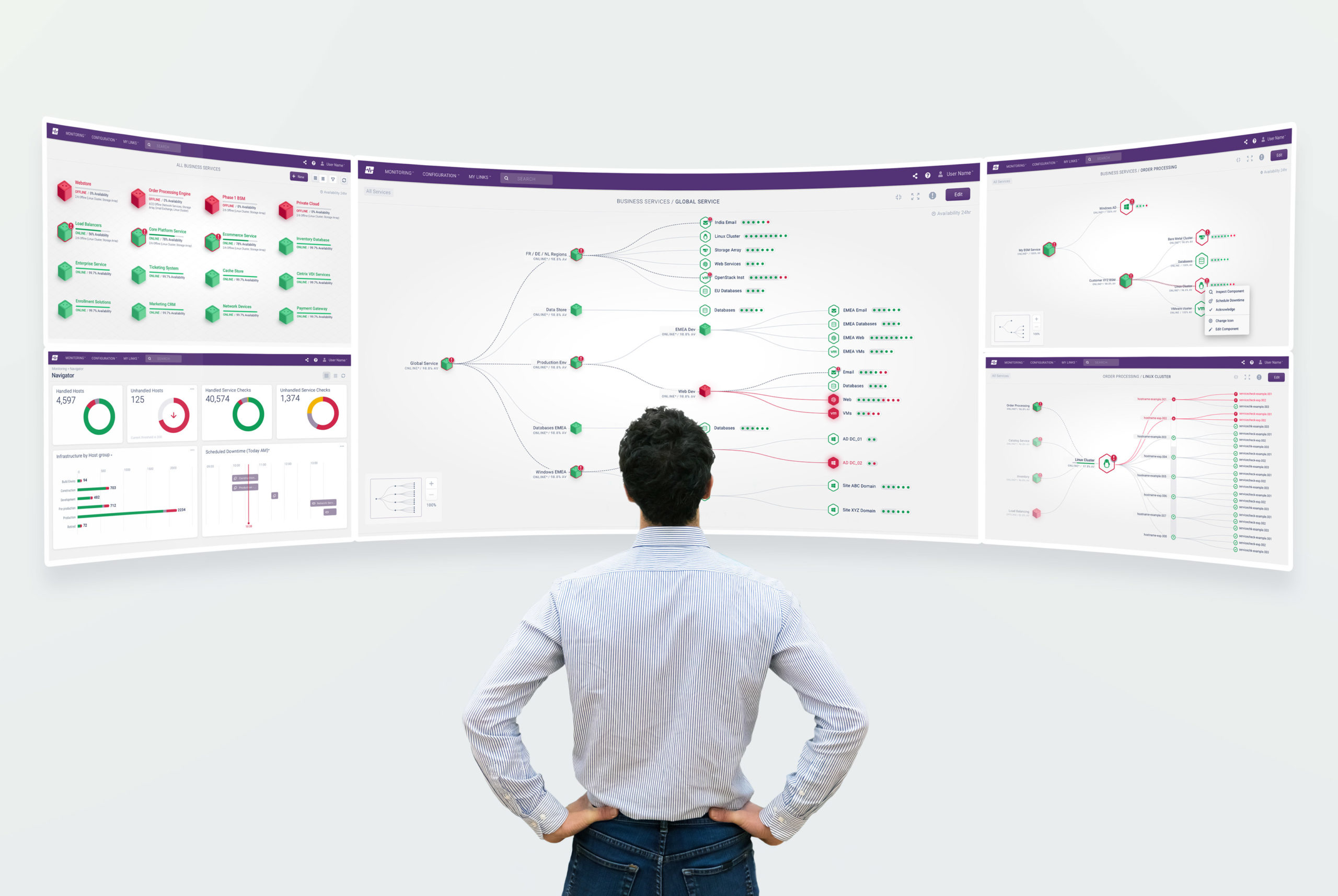
Often displayed on large screens within monitoring suites and data centres, these dashboards provide a high-level operational view of an organisation’s IT estate. Designed primarily for business executives and operational leaders, the summary dashboard communicates the overall health and status of critical business services at a glance.

The primary goal was clarity and reassurance — users wanted to see that systems were healthy, stable, and operating within expected thresholds. Alongside this immediate visual status, the dashboard also surfaced more nuanced operational metrics, including service availability, uptime, and SLA performance, enabling stakeholders to quickly assess business continuity and identify areas requiring attention.

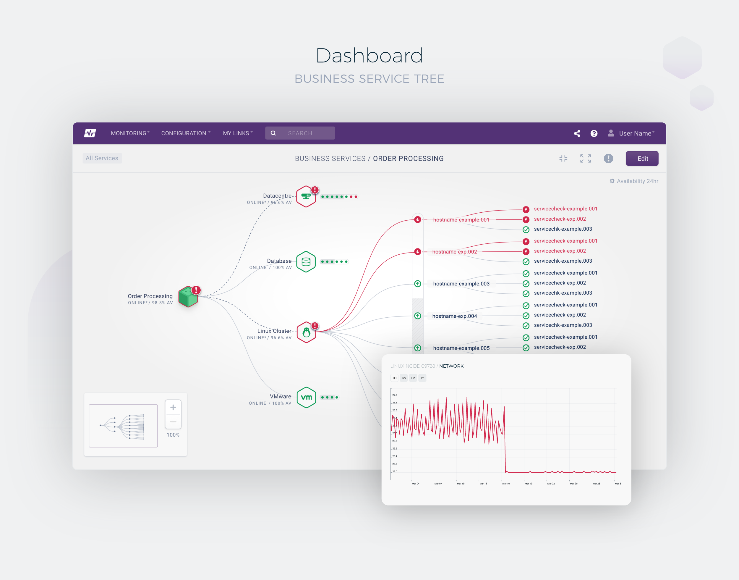
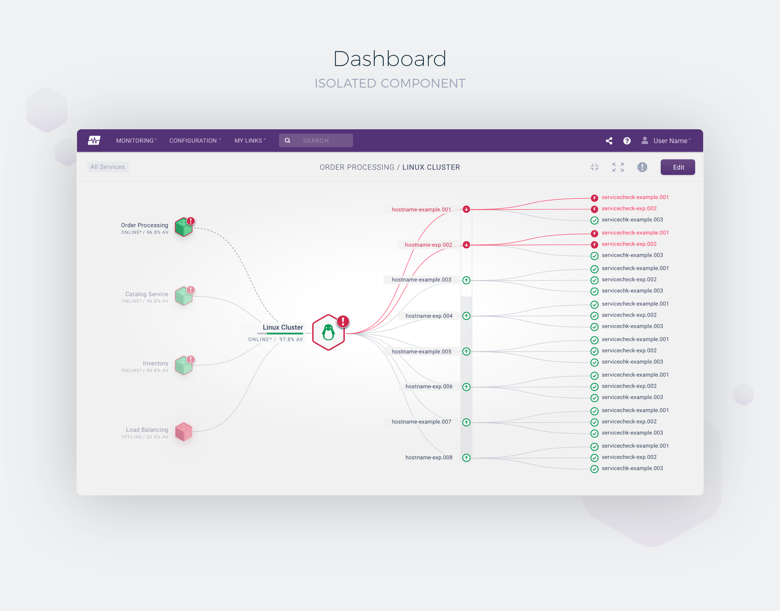
BSM Summary Dashboard BSM Tree View Dashboard

When investigating a business service, its underlying components expand outward to reveal a hierarchical tree structure of dependencies and relationships. Technology-specific icons help users quickly differentiate between component types, while the health and status of each component are communicated through colour-coded states and connecting paths.

BSM Isolated Component Dashboard

Light And Dark Theme

I also designed both day and night themes for the platform, recognising that this was not simply a visual preference but an important usability requirement for monitoring teams working across different environments and shift patterns. In darkened NOC (Network Operations Centre) settings, the night theme reduced eye strain and visual fatigue during extended periods of use, while maintaining clarity, contrast, and the immediate visibility of critical system states and alerts.

Dark theme UI
Light theme UI

Reaction

When can we have this? We need it yesterday! Please keep us up-to-date with developments and your release schedule. Love it.
IT Director
Cisco
Opsview BSM

Design Impact

Opsview Monitor 2019–2020
Design Scope
End-to-end
UX strategy to visual design system
Market Position
Flagship
Core enterprise proposition
Strategic Result
Acquired
Opsview acquired by ITRS Group

Project Milestones

From discovery to acquisition

2019
Discovery
2019
Design System
2020
BSM Launch
2020
ITRS Acquisition

Feature Capabilities

Designed to help operations teams understand complex systems through contextual, service-centric visibility.

Root Cause Analysis Executive Visibility Hybrid IT Noise Reduction Guided Investigation Service Topology Alert Correlation