Summary
Summary
Discovery
Discovery
Scoping Phase 1
Scoping Phase 1
Wireframes
Wireframes
Design System
Design System
Prototypes
Prototypes
Final Designs
Final Designs
Reaction
Reaction
Impact
Impact
Conclusion
Conclusion
ALL WORK

SAAS · DESIGN SYSTEM · UX RESEARCH

PASS ROSTER

Greenfield scheduling, HR & finance platform for UK social care — researched, designed and systemised from zero.

Project scope

Design a new scheduling, HR, and finance tool from the ground up, integrating it with existing care planning software and syncing with carers via the app on their phones—all while starting amidst the pandemic and under a 'top secret' mandate.


My role

As the new head of UX in a relatively small team, I took on multiple roles while closely collaborating with leads across the business. At the same time, I was also recruiting additional designers for my team. My responsibilities ranged from initial research and discovery to extensive requirements gathering and prioritisation. I analysed existing research artefacts and created many more, I interviewed customers, mapped user flows, and helped define the boundaries of what constituted the 'MVP'. Working alongside the product and technical leads, I contributed to strategy, business analysis, and the development of an evolving delivery roadmap with the customer first and foremost in mind. When it came to wireframing and prototyping, I was hands-on in leading the design of a new UI design system—one that would spearhead a refreshed front end, now being implemented across other areas of the system.

Scope New SaaS product
Role UX Lead, product management
Duration 2021 - 2024
Outcomes Approved status by one of the UK's largest care franchises
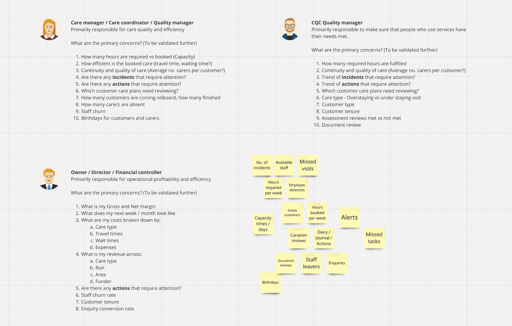
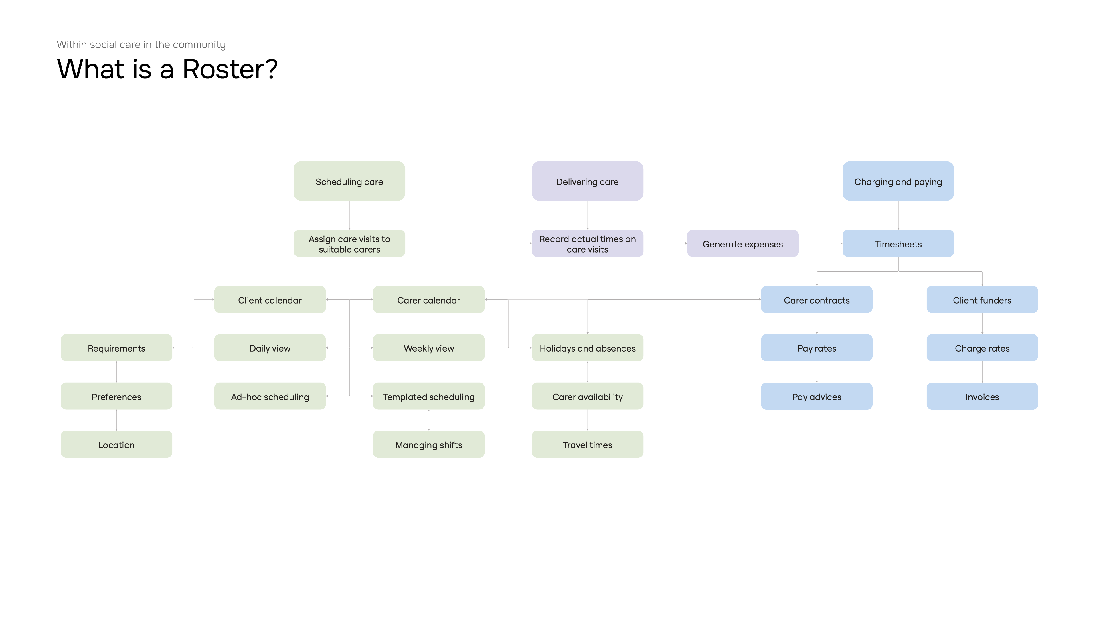
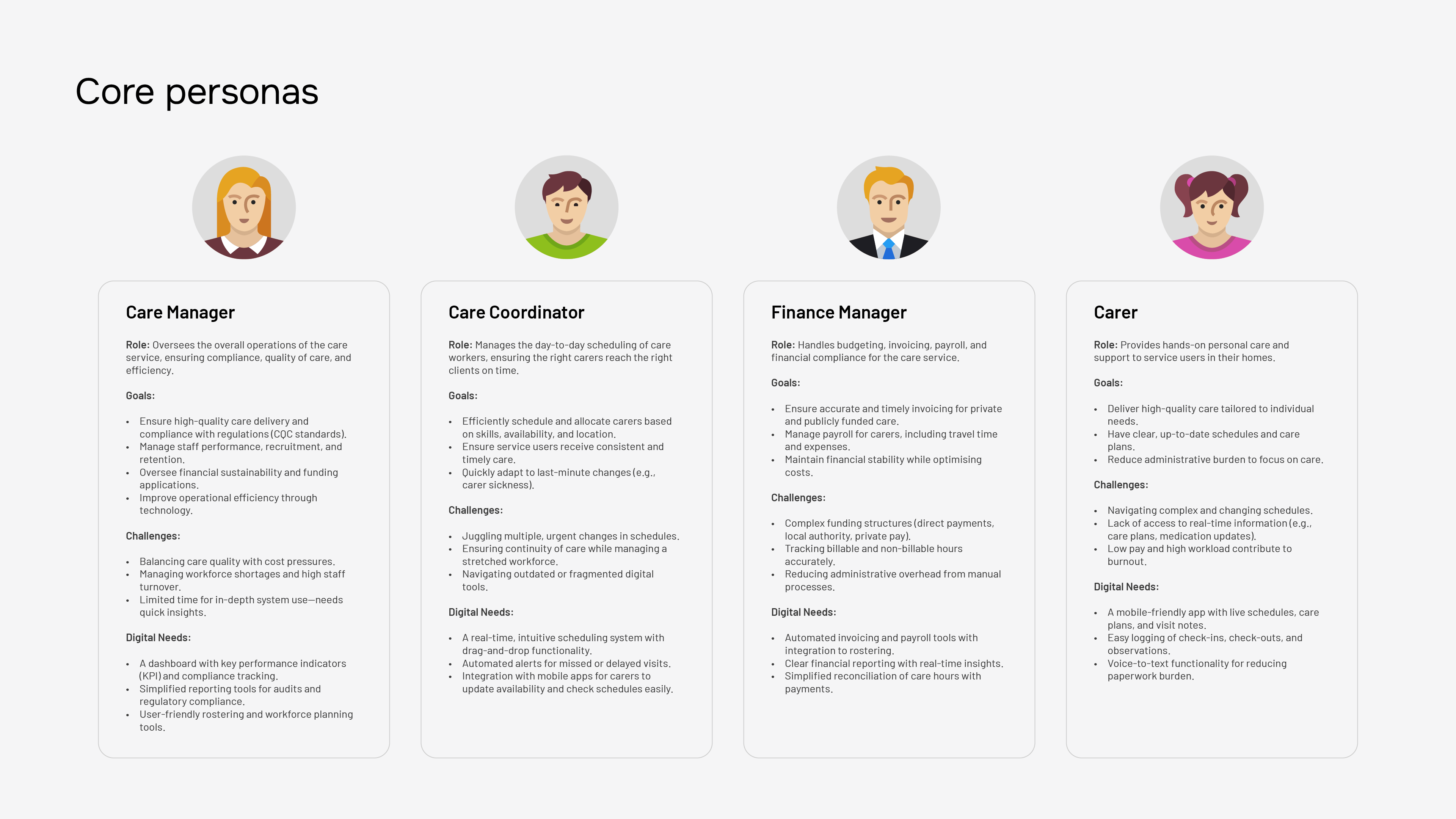
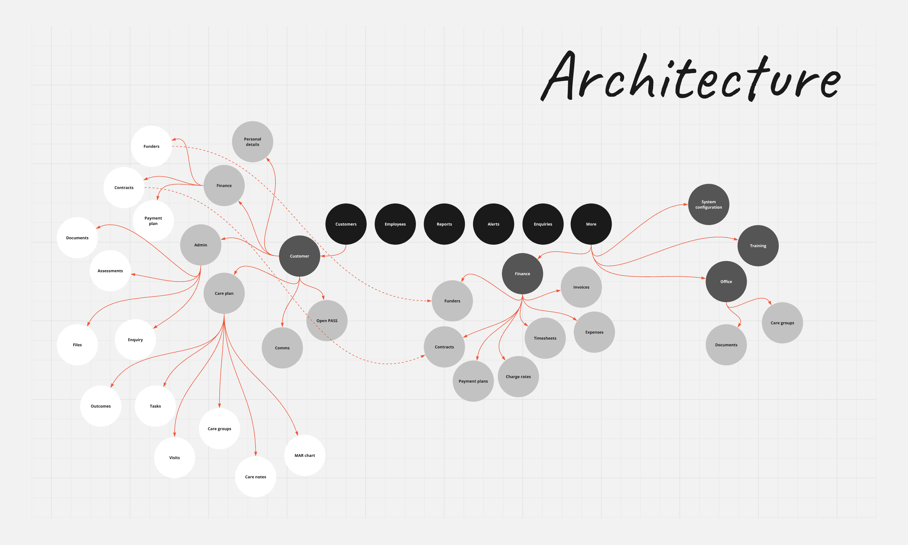
Flow diagram showing PASS Roster system architecture User personas for the PASS Roster system

Discovery

One major constraint was the business directive to develop phase 1 of the product without industry exposure. This meant user recruitment was limited to fewer than a handful of customers under a stringent NDA process during the initial discovery phase. Early feedback confirmed that building a rostering system for social care is among the most complex challenges our customers face — with requirements spanning a vast array of operational needs. The system would need to be approximately 50% larger in scope than the care management tool that had established PASS to date.

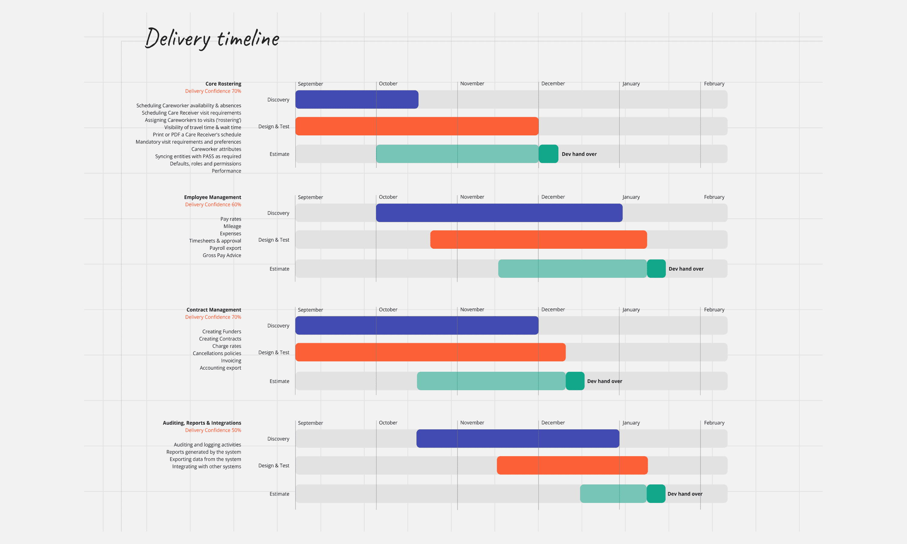
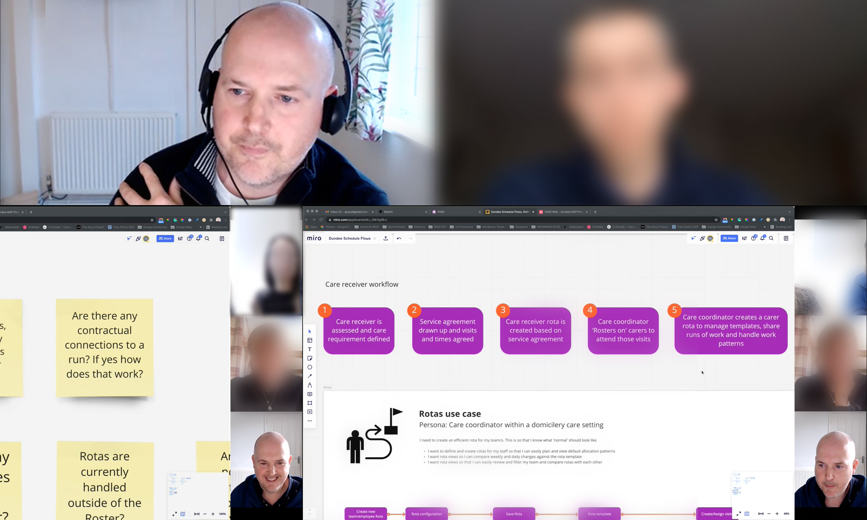
At first glance, rostering might appear to be a calendar for clients and carers, with some HR and financial components. However, the reality was far more complex — an iceberg where the visible UI masked incredible depth and breadth of user requirements and workflows. RFP documents outlined hundreds of expected features, making the task feel more like developing an entire suite of products rather than a single solution. To break down this complexity, we adopted a phased delivery approach — defining the core features that would form a viable beta product. To build confidence in the plan, I partnered with the lead product manager to conduct in-depth interviews and collaborative workshops, helping to chart a clear way forward.
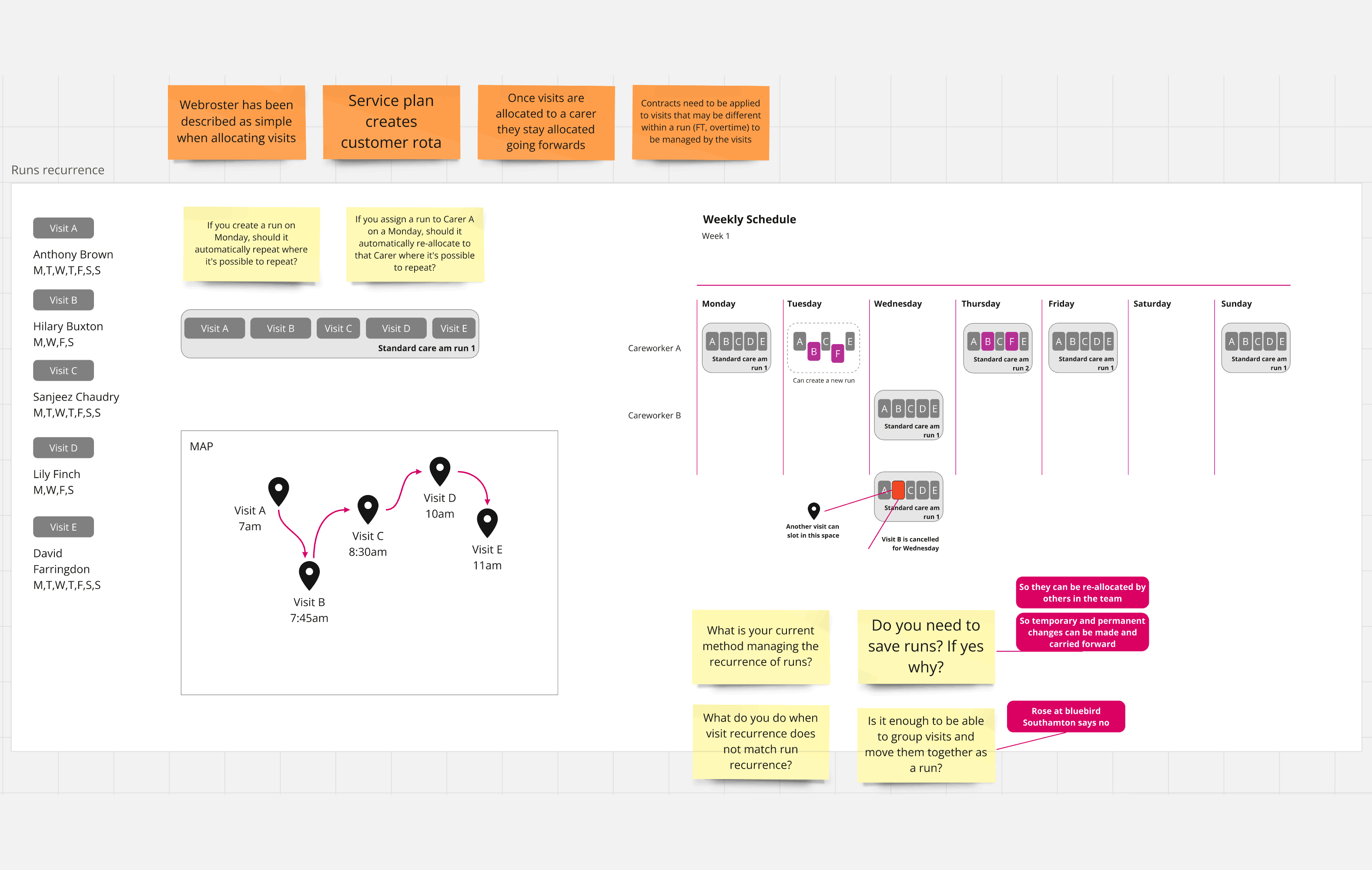
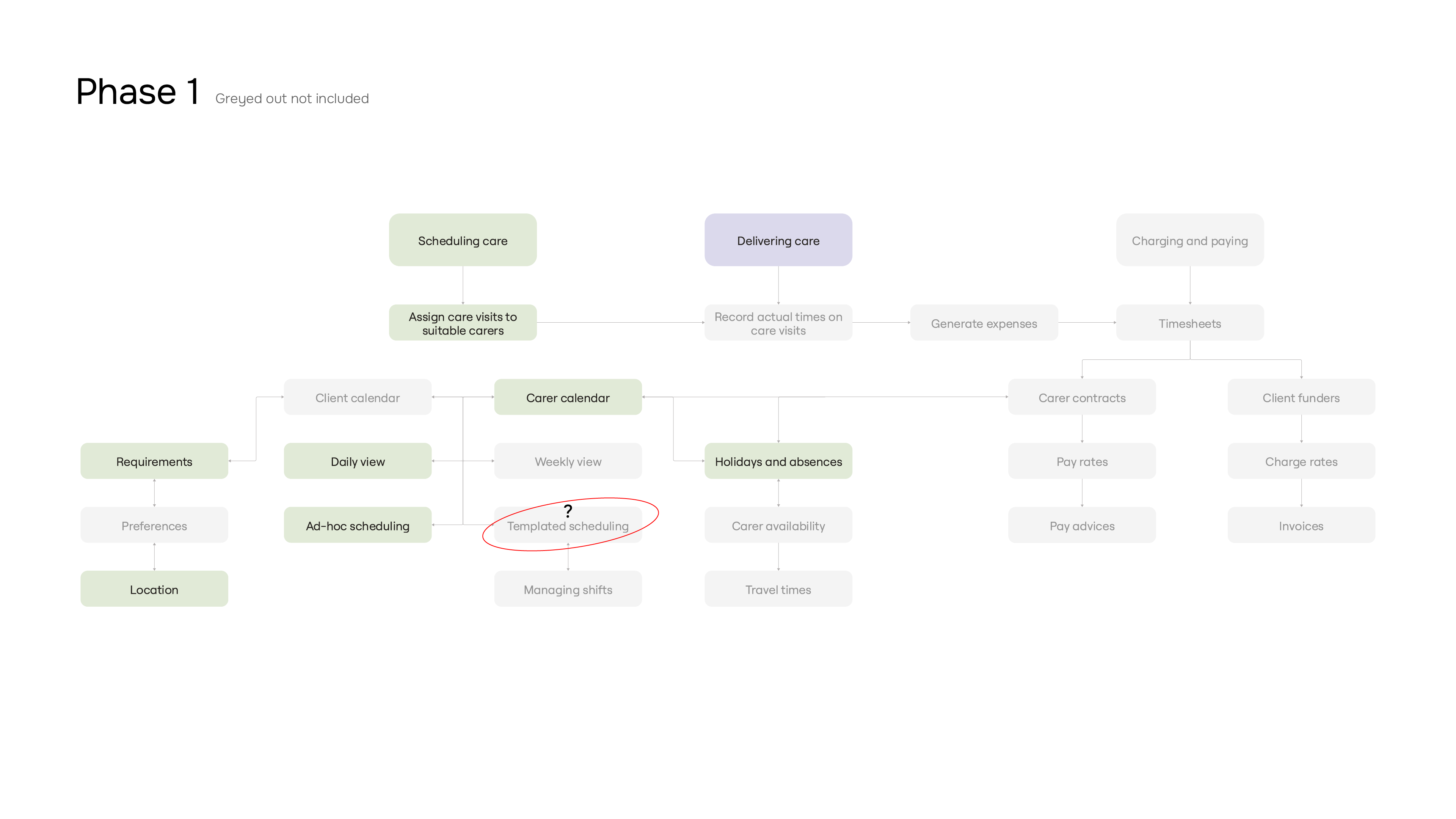
Phase 1 system flow diagram

Phase 1

Through close engagement with customers, I identified critical gaps in the initial scope of Phase 1. While the original plan focused on delivering a streamlined daily scheduling tool for carers, user feedback revealed that this was just one perspective. Additionally, since there was no way to save a shift pattern, users would have to reassign visits manually every single day, which would significantly hinder adoption. Customers highlighted real-world constraints we hadn't fully accounted for—such as the complexity of shift patterns, travel times, and the need for templated shifts to avoid unnecessary repetitive tasks. These insights challenged our assumptions about what constituted a viable first release.

To ensure we were building a product that would genuinely meet user needs, I presented these findings to stakeholders, illustrating the risks of launching without key functionality and demonstrating how a few targeted adjustments could enhance usability and adoption. Our development partner initially pushed back, concerned that templates would be overly complex and nearly impossible to accommodate all edge cases. By providing further evidence, competitor benchmarking, and helping to ideate logical workflows, I ensured that the necessary changes were incorporated, reshaping the scope of Phase 1 to deliver immediate value while maintaining a manageable development timeline.

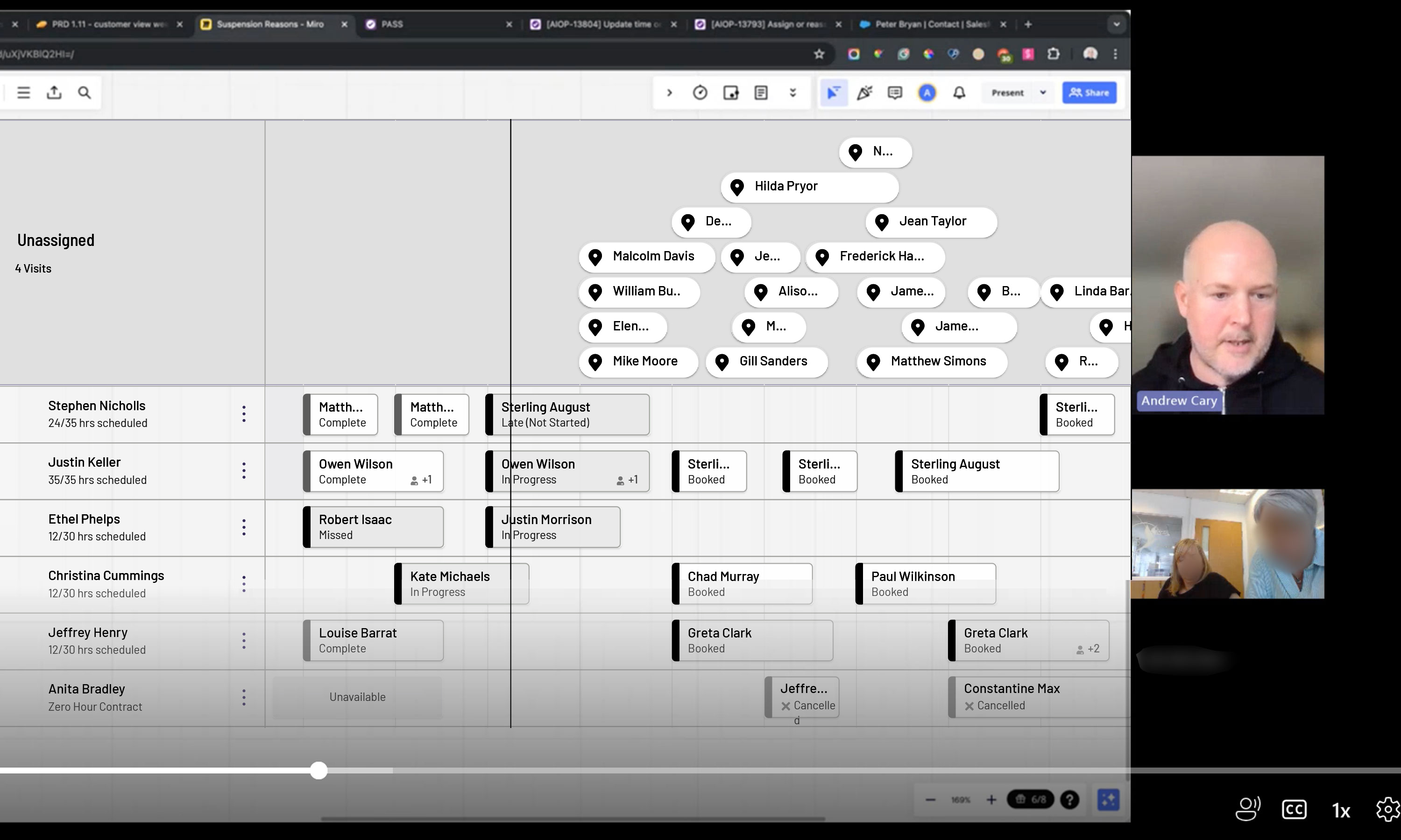
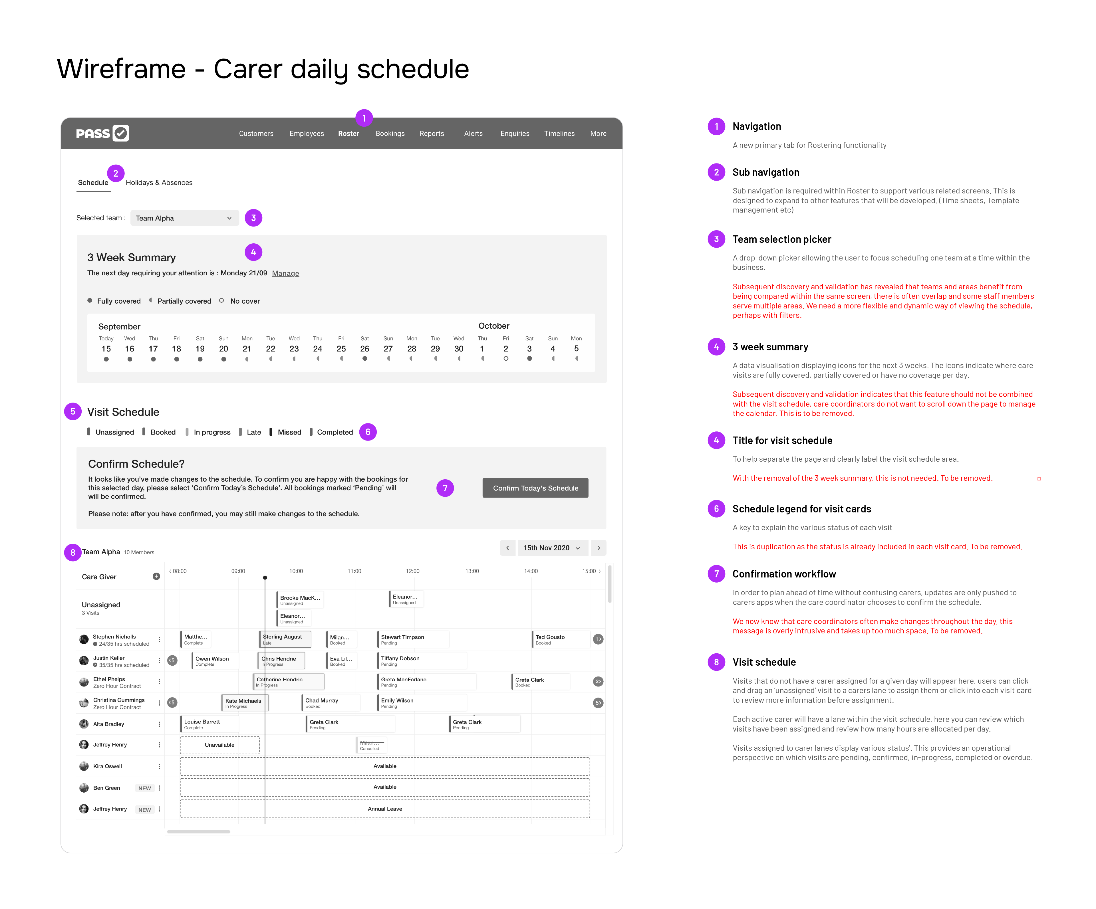
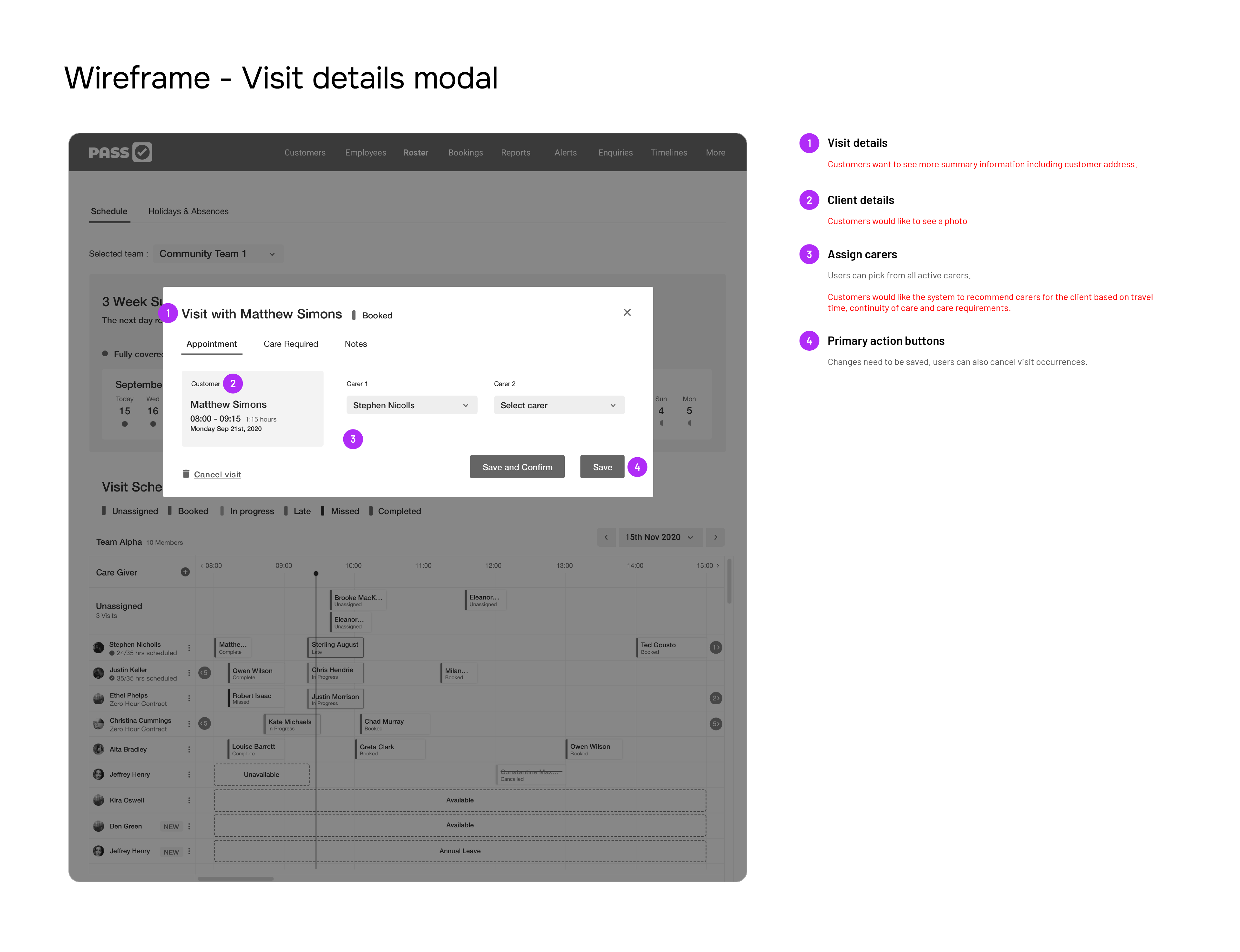
Initial wireframe for scheduling tool Wireframe for visit details screen

Wireframes

A couple of wireframes for the scheduling tool were already in progress when I joined the company. The leadership team had engaged a third-party development agency to help accelerate development. However, this presented challenges, as the agency, constrained by budget and time, couldn't dedicate as much effort to research as we could internally.

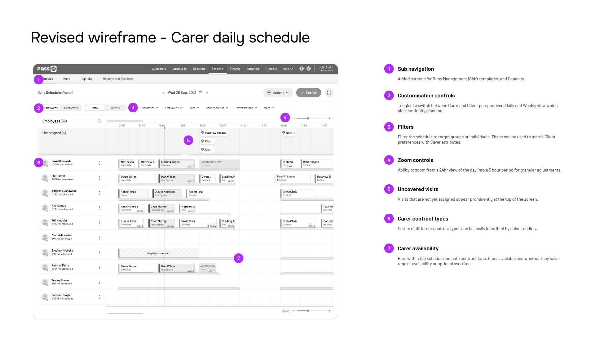
Once I was up to speed and had engaged with our customer base, it became clear that some of the decisions made up to that point were not fully optimised. Additionally, there was uncertainty about who would 'own' the design going forward, especially with other projects running in parallel. I made the case that this was the business's most important project—a major strategic shift—and that I should be dedicated to it. As a result, I took over the wireframing process, and my team and I continued to validate our designs with customers, striving to surface the core information they most wanted to see first.

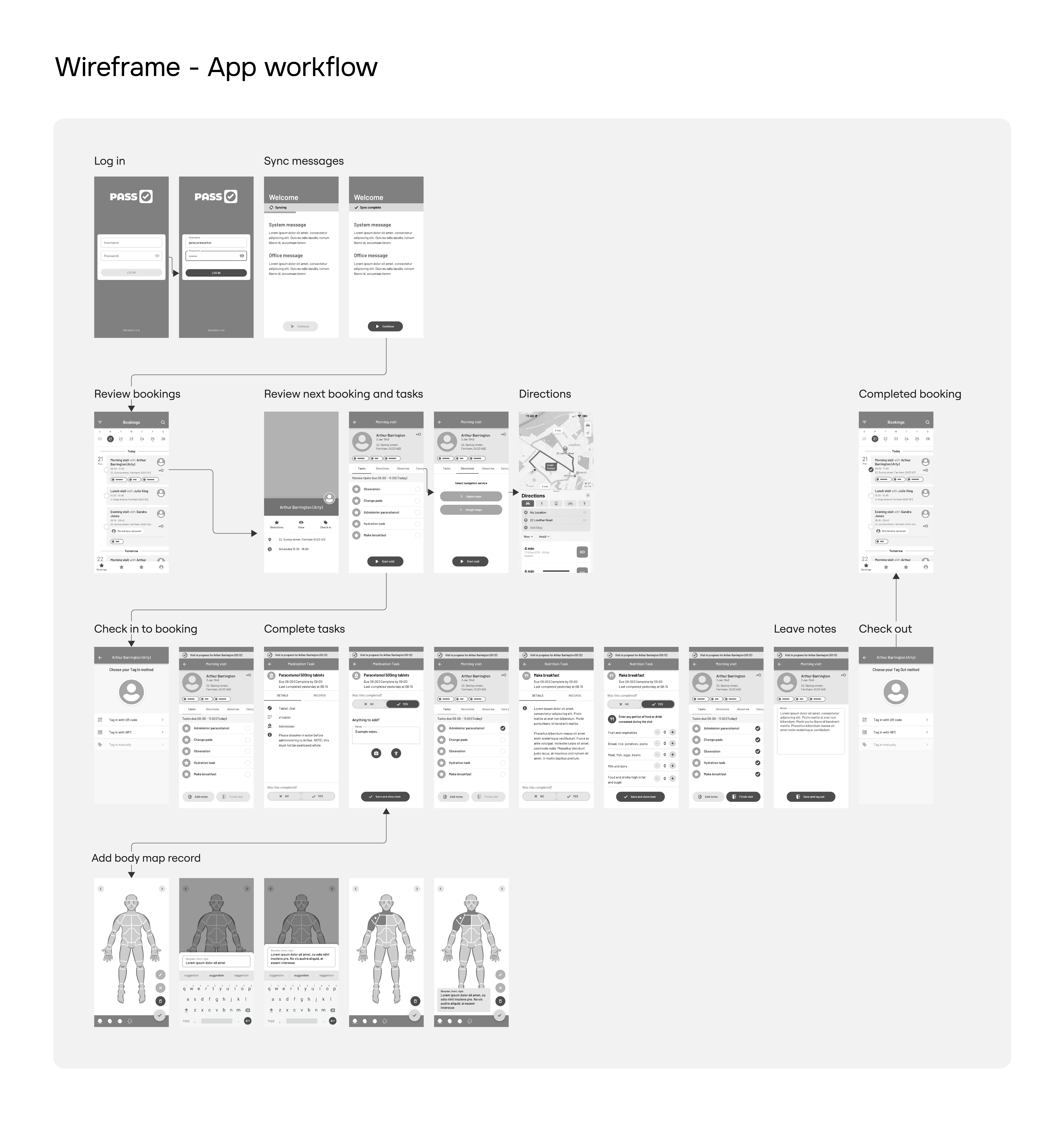
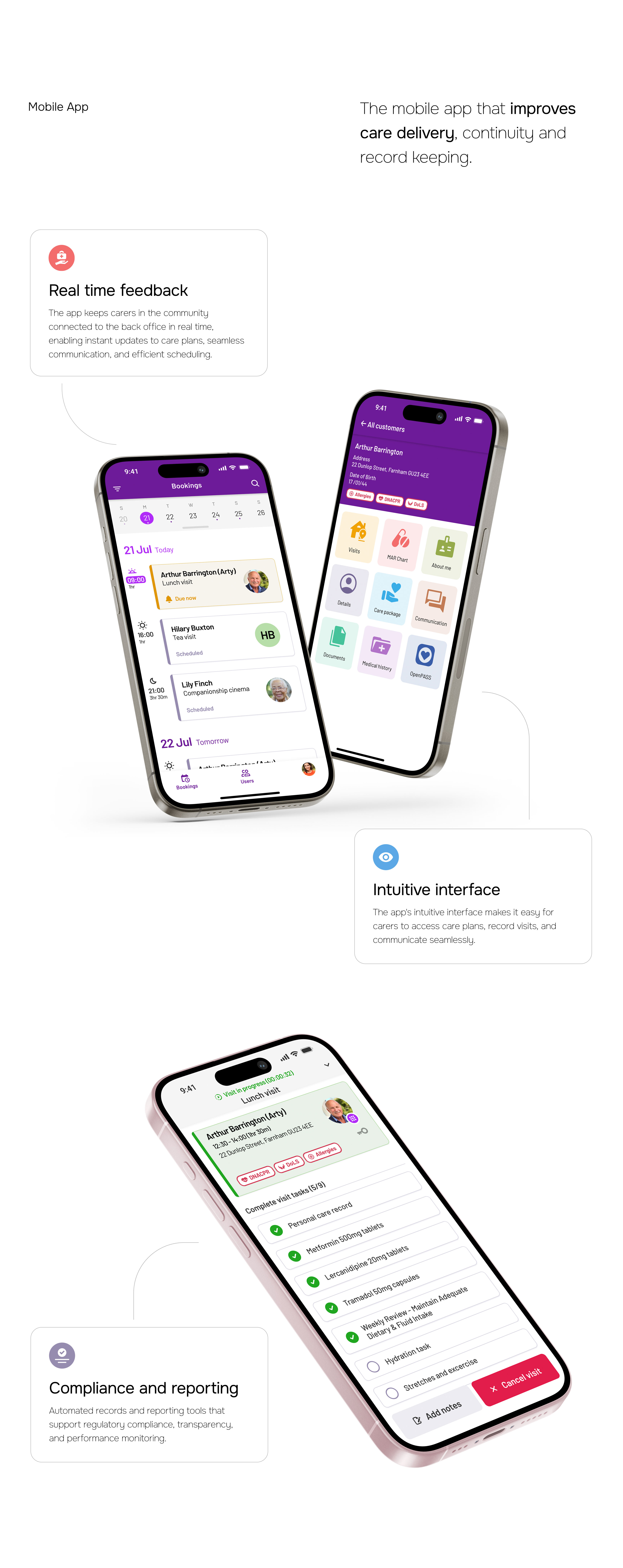
We also had an update to the mobile app in progress, which needed to adapt to the new roster workflow. Previously, the PASS app integrated with third-party rostering solutions, but with our new system, we had complete control over the flow—from scheduling to publishing visits to the app. There were very tight deadlines to incorporate new, streamlined workflows while also updating the UI to align with the evolving design pattern.

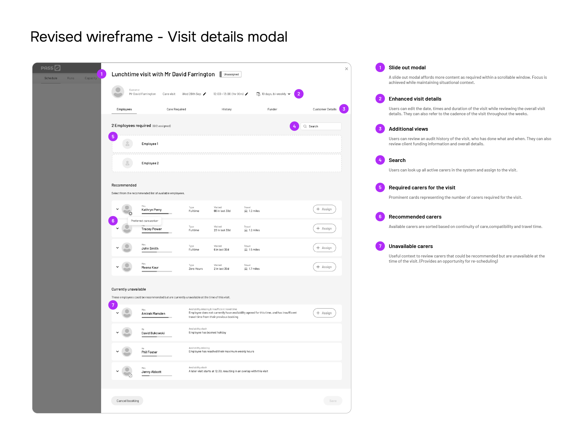
Updated wireframe for scheduling tool Updated wireframe for schedule modal Mobile app wireframe

Design System

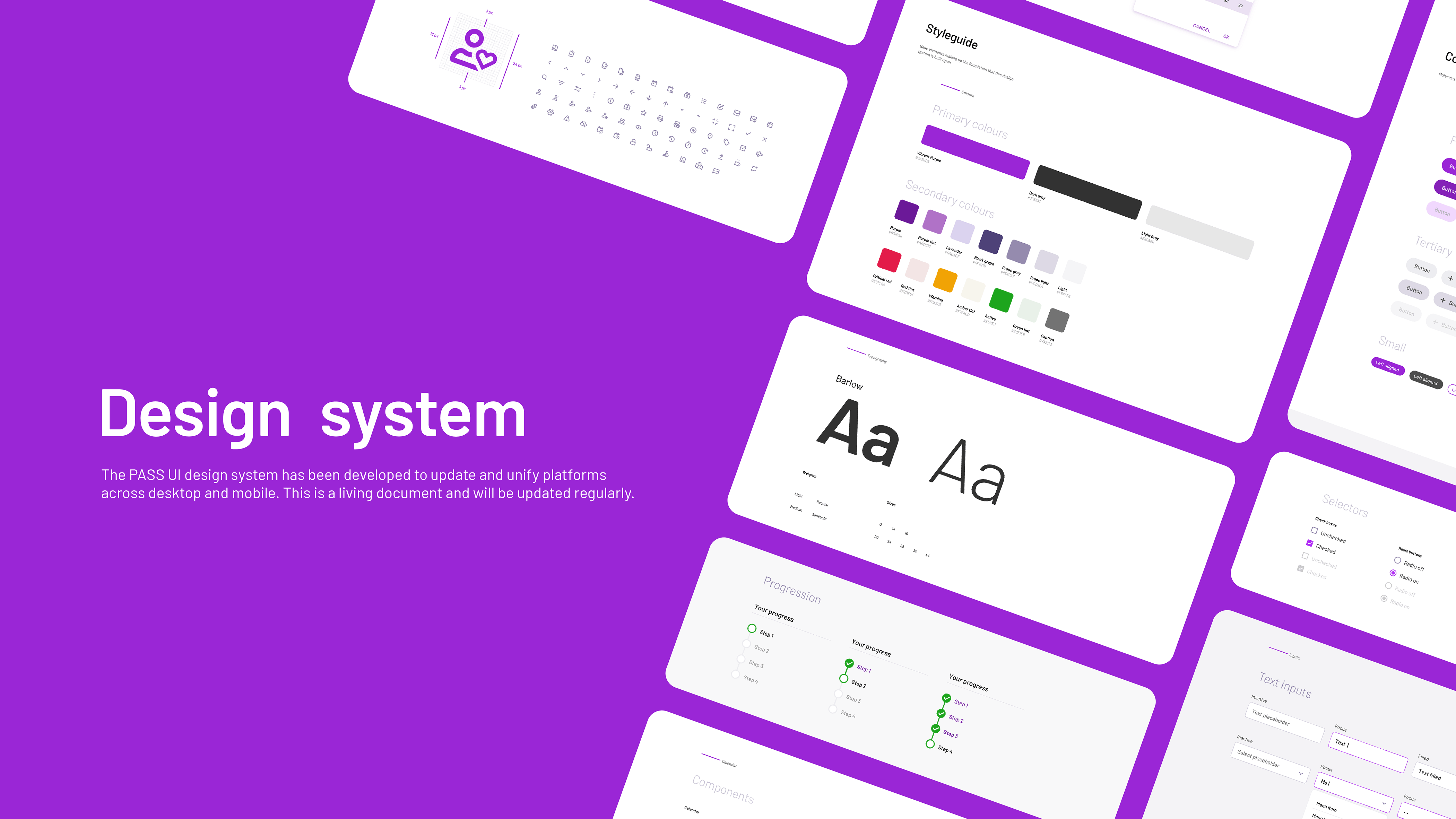
I led my team in developing a robust UI design system that unified our digital experiences across desktop and mobile platforms. Initially using Sketch, we established a structured design framework, breaking down interfaces into fundamental components, templates, and pages. This approach allowed us to create a shared library of reusable elements, ensuring design consistency and efficiency. Our team collaborated closely to define design principles, component behaviours, and accessibility standards, promoting design thinking across teams.

To streamline the handover process and enhance collaboration with developers, we integrated Zeplin into our workflow. This allowed us to export designs seamlessly from both Sketch and, later, Figma, providing developers with precise specifications, assets, and style guides. Zeplin's automatic generation of code snippets and redlines minimised guesswork, reducing back-and-forth communication and accelerating development timelines.

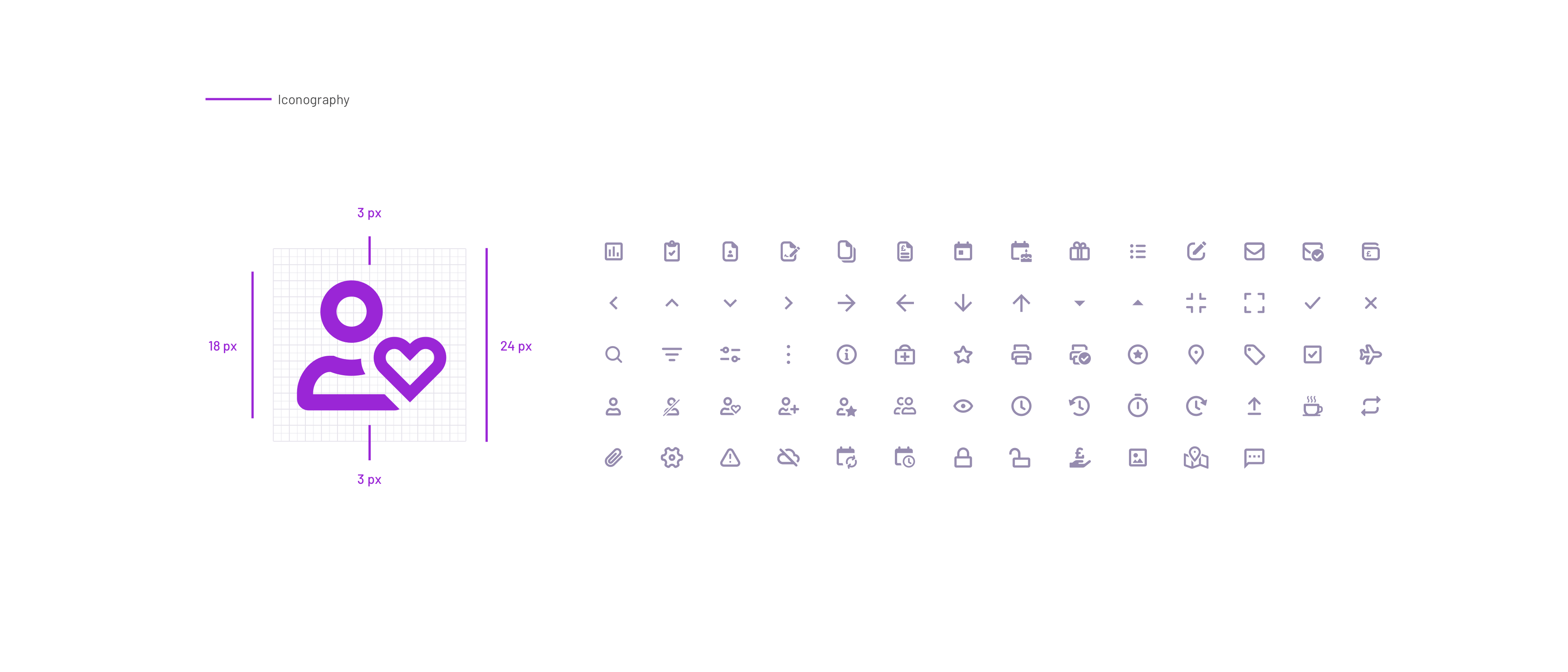
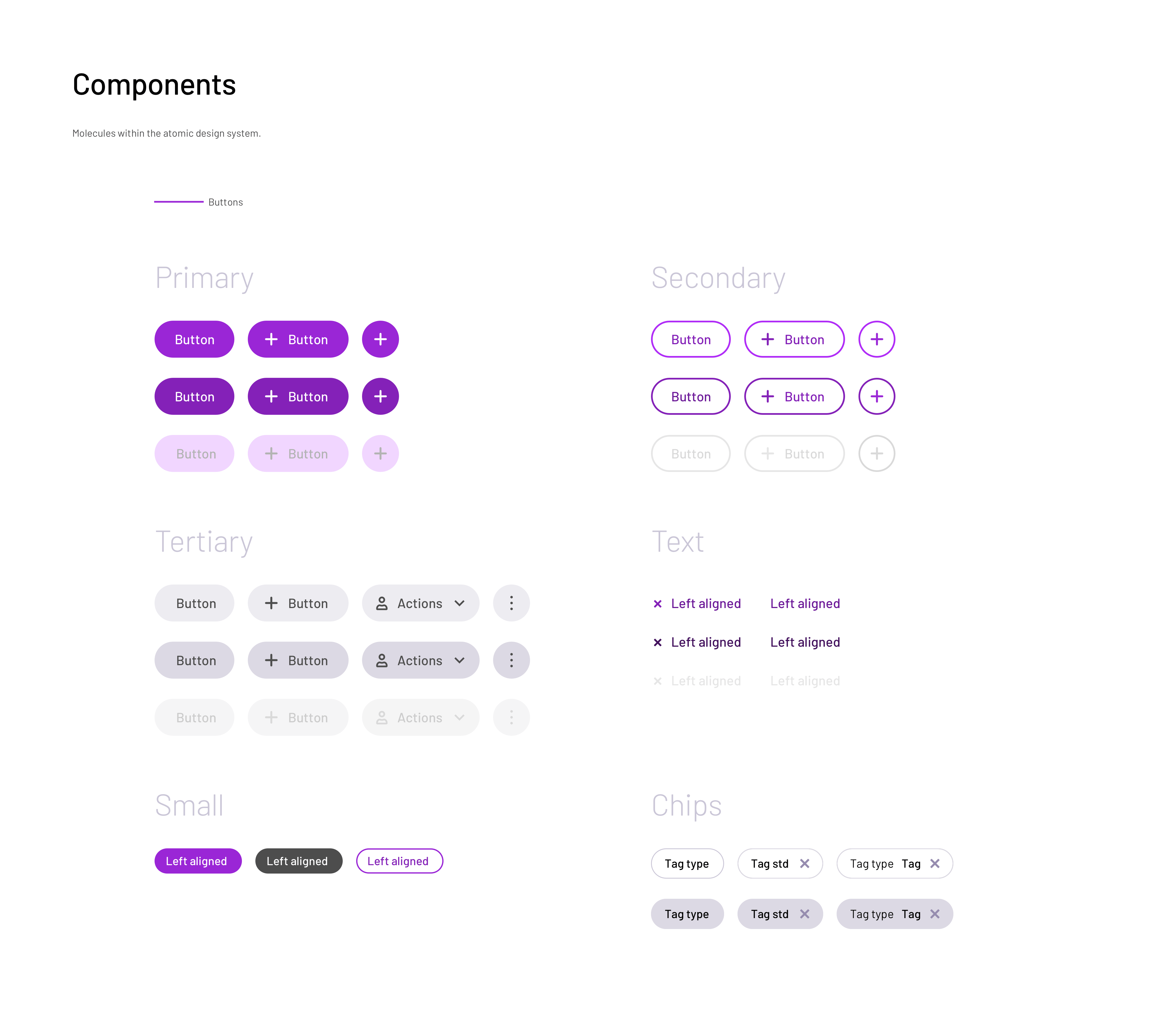
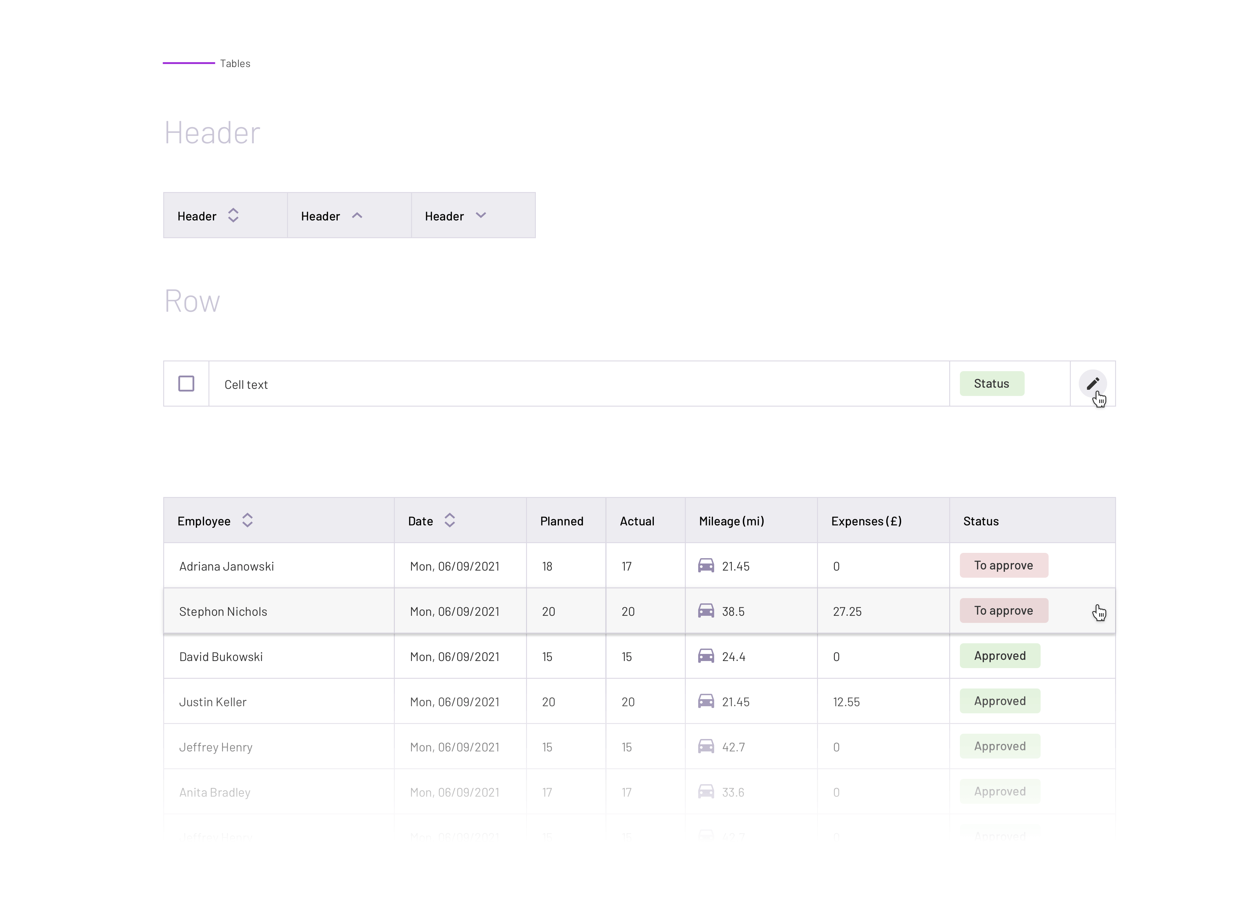
UI design system cover Color palette and typography in the design system Icon set in the design system Button components in the design system Onboarding UI components Calendar UI components Visit details UI components Table components in the design system

Prototypes

Prototyping in Miro and later Sketch provided an excellent workflow for developing wireframes iteratively based on the user journeys we captured during initial discovery. This approach allowed us to quickly test initial concepts with our test group, gathering valuable feedback before progressing to high-fidelity designs. We worked on wireframes in parallel across different areas of the tool; I led the calendar and scheduling flows, and we held regular catch-ups to ensure alignment. I had an open forum for design reviews, encouraging collaboration between the design and product teams.

As the project evolved, the scope expanded continuously based on ongoing customer feedback. The business aimed to release an MVP prototype focused on scheduling carers, while finance and HR features were intended to follow in later design phases. However, it became increasingly apparent that customers expected all these features to be in place before adopting the product. This led to internal debates about what a roster should and shouldn't include. We had to consistently remind stakeholders of customer expectations and present feedback data to demonstrate that the scope was much larger than initially anticipated.

Final Designs

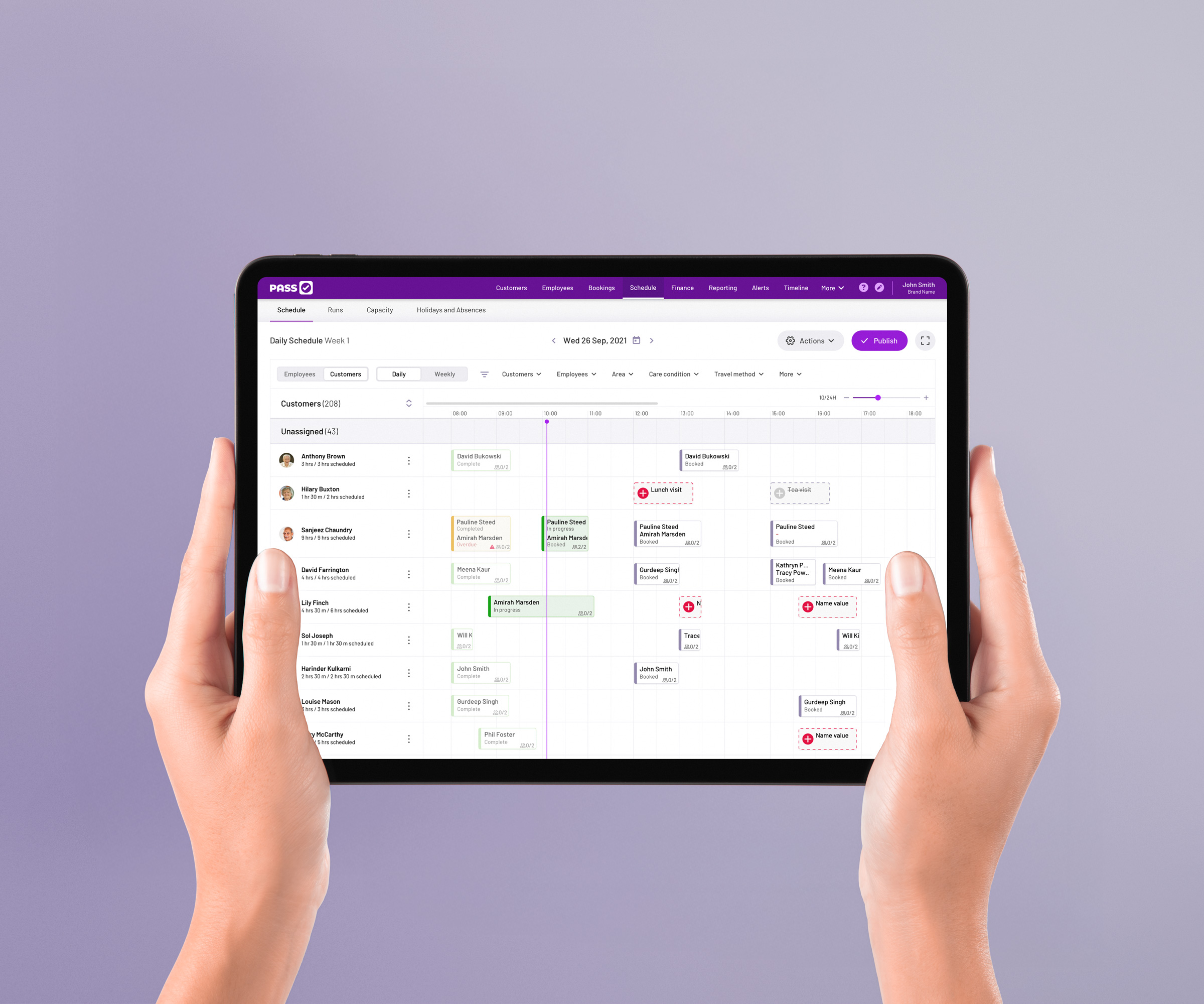
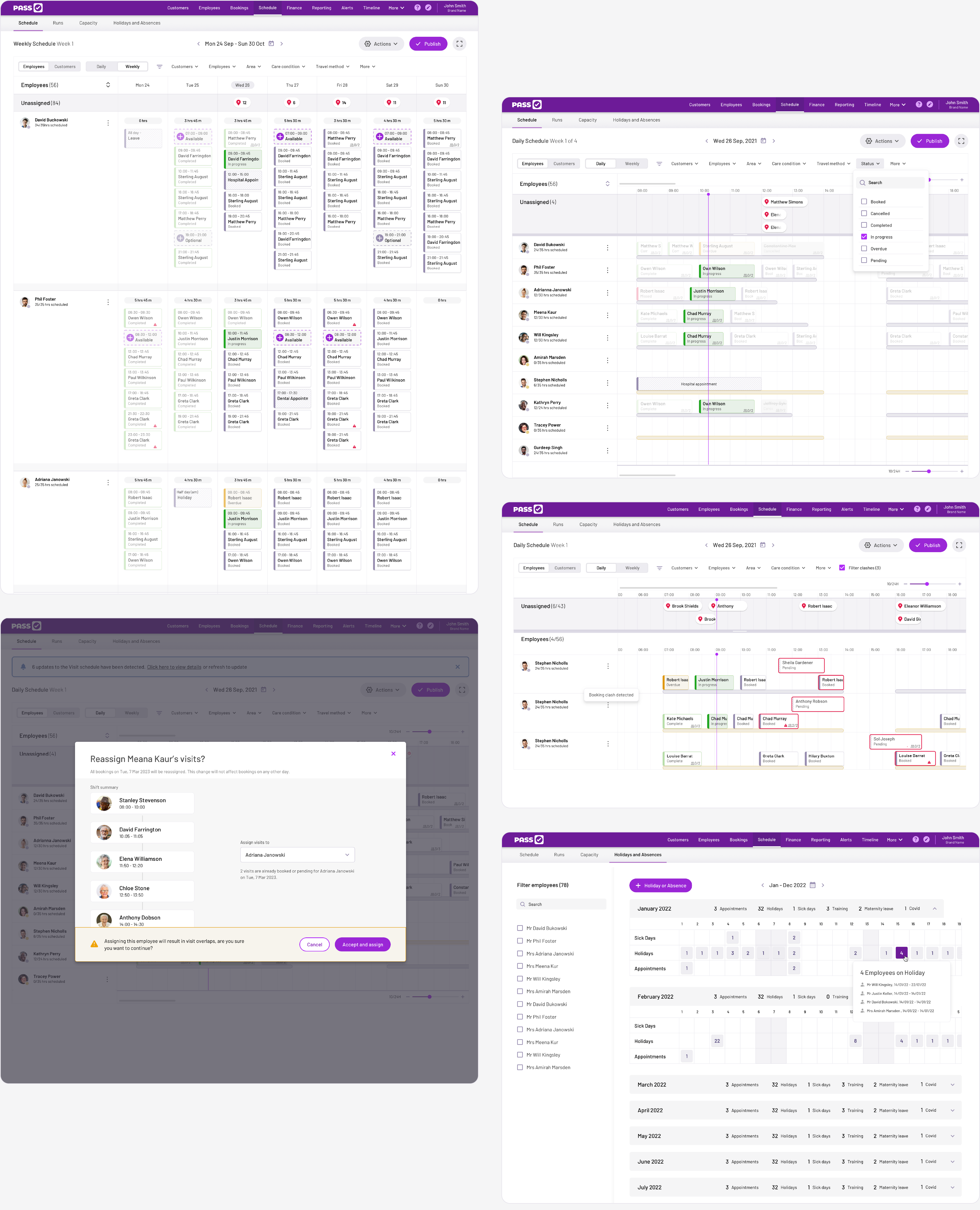
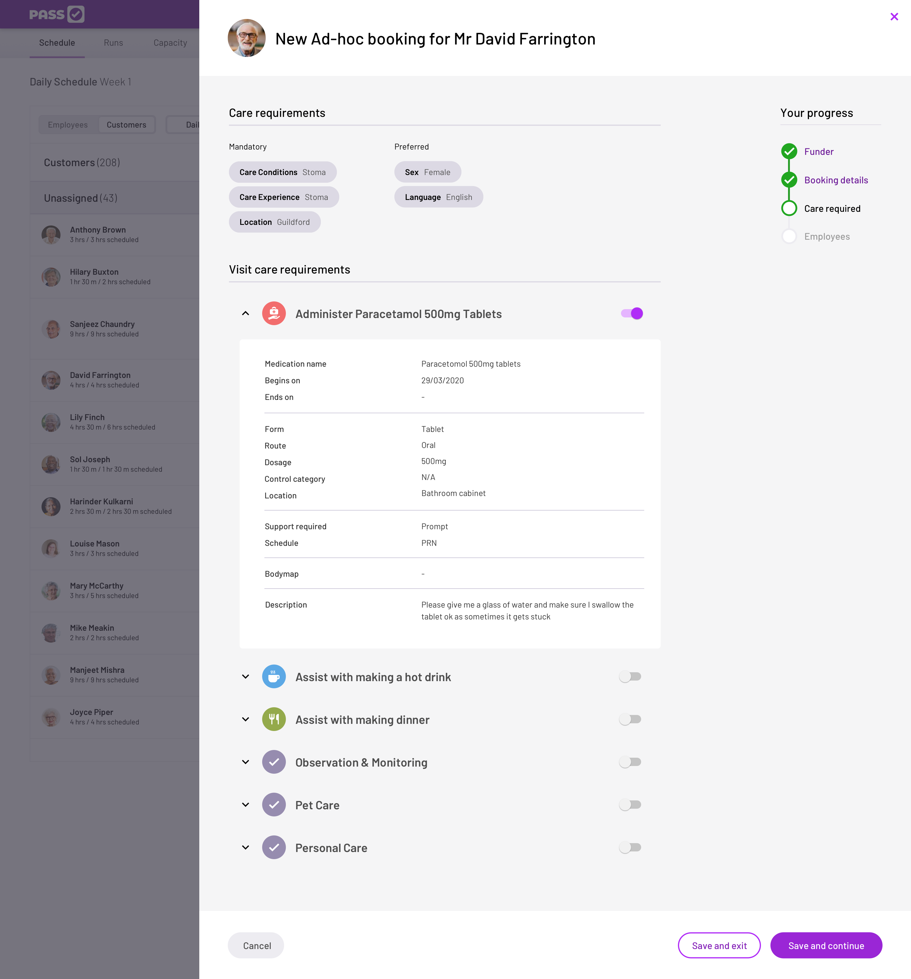
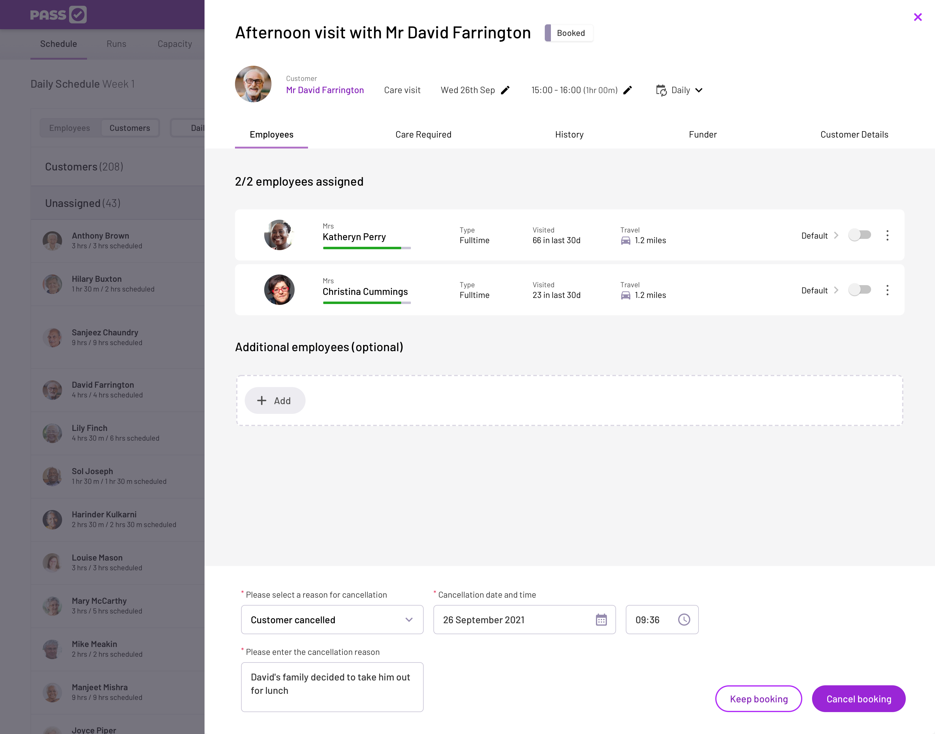
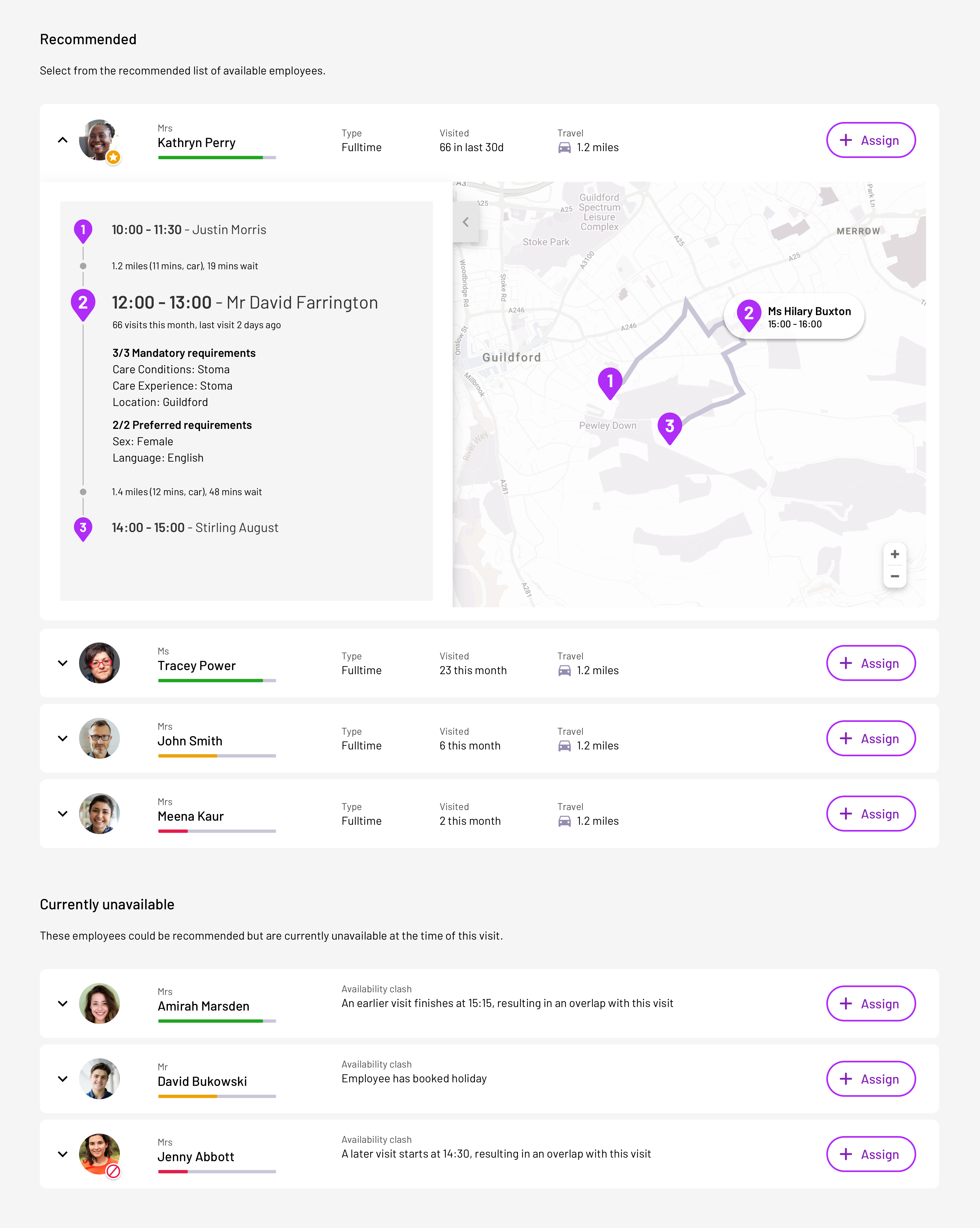
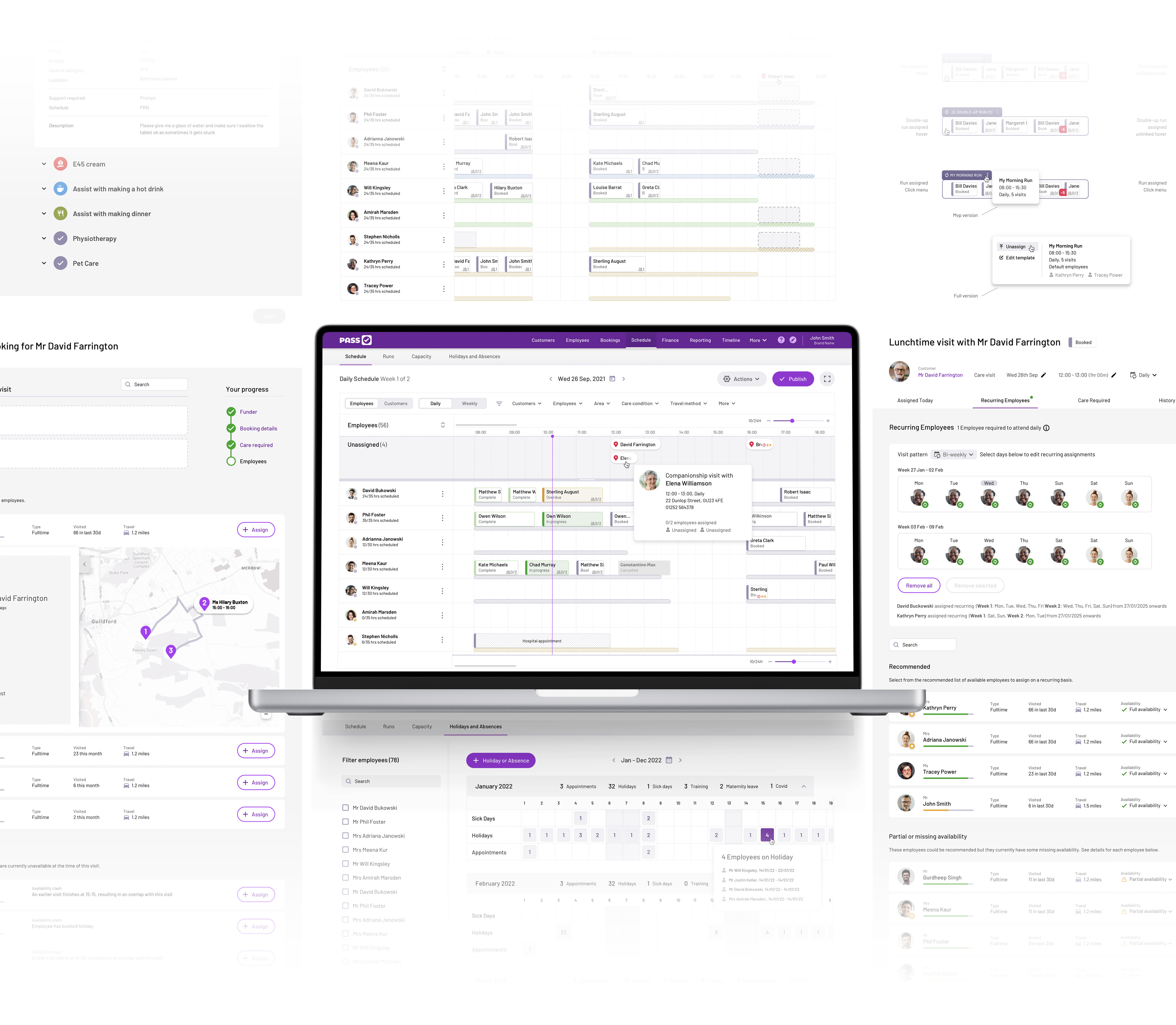
A selection of final designs across the rostering system showcases key interfaces and functionalities. The system is designed to streamline scheduling, with a focus on enhancing visibility, maintaining clear visual hierarchies, and delivering a modern, clean look and feel—all with accessibility in mind. Users can concentrate on scheduling care appointments, with the right insights presented at the right time to best match carers to clients. Tools such as 'recommended carers', templated shift patterns, and multi-select features combine to create intuitive efficiencies that reduce the administrative burden. These visuals demonstrate how the rostering system not only meets business requirements but also enhances the overall experience for both staff and service users.

Carer Daily Schedule on iPad Schedule screens final design Visit details final design Cancel visit final design Recommended carers feature Mobile app final designs
PASS Roster system screens

Reaction

We love your Roster, we're excited! This looks looks much more user friendly than anything else we've seen out there
Hugo M
Director
PASS Roster

Post Launch Impact

everyLIFE Technologies 2021-2024
Revenue Growth
93%
2021 to 2024
Active Services
1,200+
Care providers
NHS Assurance
14/14
Standards achieved

Growth Timeline

Indexed to 2021 baseline

2021
100%
2023
120%
2024
193%

UX Design Impact

What measurably changed for care teams once the platform went live

Fewer missed & late visits

Live rosters and alerts flag coverage gaps in real time, so teams act before care is affected.

Less time lost to back-office admin

Timesheets feed straight into payroll and invoicing — no double entry, fewer reconciliation errors.

One system instead of many

Care plans, meds, scheduling and finance in a single workflow, replacing disconnected tools and spreadsheets.

Sparkle icon

Business Improvements

UX-driven design decisions that unlocked new opportunities

Broader Product Footprint

Full care-management stack (operations + finance + clinical)

Stronger Market Traction

>1,200 services, tens of thousands of daily active carers

NHS Assurance

Full compliance across 14 NHS Digital Social Care Records standards

Customer Benefits

How thoughtful UX design improved outcomes for care providers and receivers

Joined-up Workflow

One unified platform for plans, rosters, meds, timesheets and invoicing

Reduced admin errors from system handovers

Smart Rostering

Drag-and-drop scheduling with holiday/absence handling and staffing alerts

Fewer missed/late visits

Reduced Back-Office Time

Automated timesheets → payroll → invoicing

Faster billing cycles and less paperwork

Improved Safety

Live care plans and eMAR at point of care

Easier inspections and audits

Design Features → Real Outcomes

Concrete examples of how UX decisions delivered measurable value

Feature

Roster + Live Care Plans + Alerts

Outcome

Fewer missed/late visits and quicker corrective action

Feature

Integrated Timesheets and Invoicing

Outcome

Lower admin time, fewer reconciliation errors, faster invoicing

Feature

NHS Assurance / G-Cloud Listing

Outcome

Easier procurement for public buyers, more confidence during inspections